
Optimizing User Experience: Enhancing Plugshare for Seamless EV Charging
UX Case Study
Reimagining a better user experience for EV drivers, simplifying the process of finding charging stations, and creating a visually appealing, consistent design system. This project aims to provide users with a seamless journey from finding a charging point to successfully charging their electric vehicles.
What I decided to do

To tackle this challenge, I focused on the following key goals:
Discover the pain points through user research and competitor analysis.
Define the inconsistencies and areas needing improvement.
Iterate on potential solutions, creating wireframes and testing with users.
Implement a clean and cohesive design system for a better user experience.
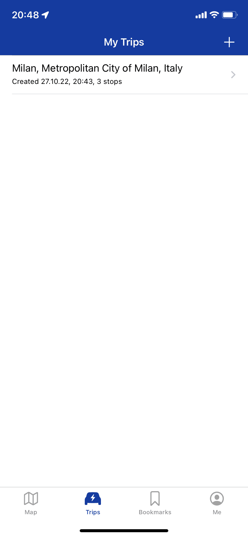
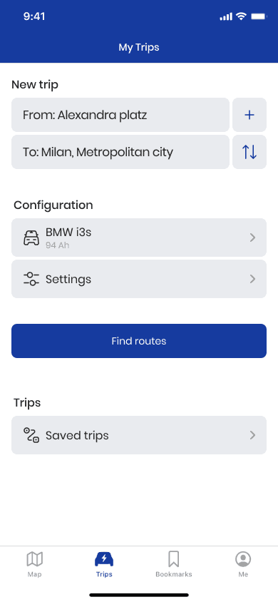
Define
Prototype & test
Understand
Ideate
Introduction
Electric vehicle (EV) adoption is on the rise, which has created a demand for intuitive and reliable apps to help users locate and utilize charging stations. My challenge in this project was to optimize the Plugshare app’s user experience to help users quickly and effectively find the right charging points for their vehicles, while addressing design inconsistencies and improving overall navigation.
Issues Identified:
Inconsistent Design and Standards:
The app suffered from varying UI elements, inconsistent color usage, and a lack of adherence to design standards across different screens.
Users found it challenging to navigate the app and trust that they were using the app correctly, as different sections looked disconnected.
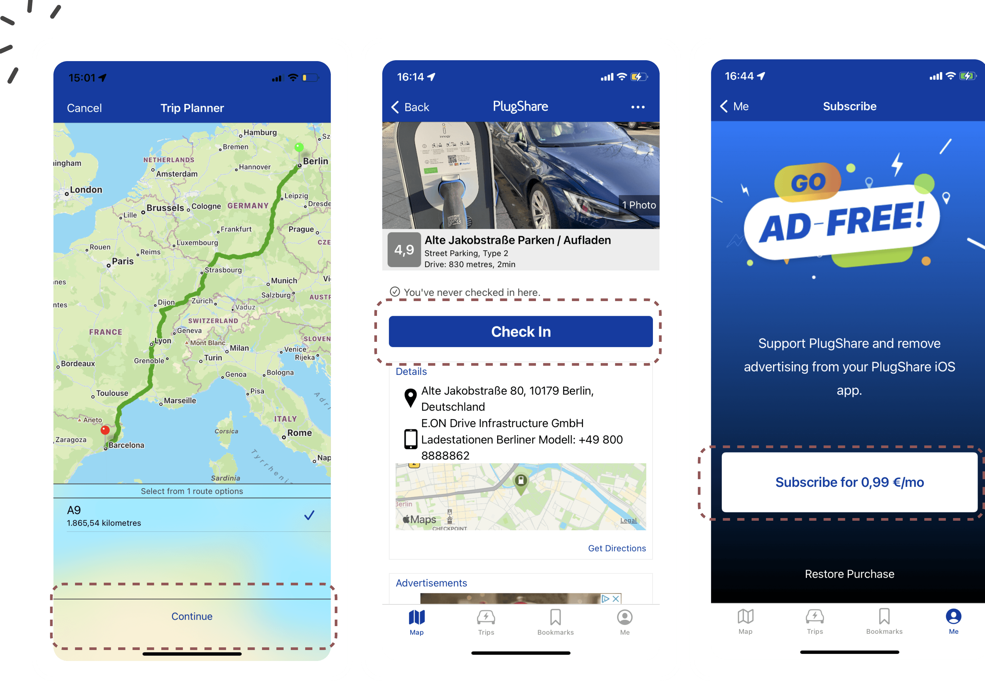
Aesthetic and Minimalistic Design:
There was a need for a more modern, aesthetically pleasing design that simplified the overall experience without overloading users with information.
The new design aimed to declutter the interface and align with modern design principles, enhancing usability and visual appeal.
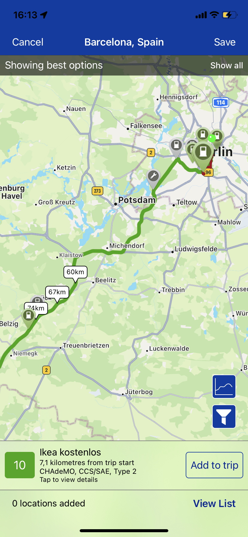
old design
new design
User Recognition and Assistance:
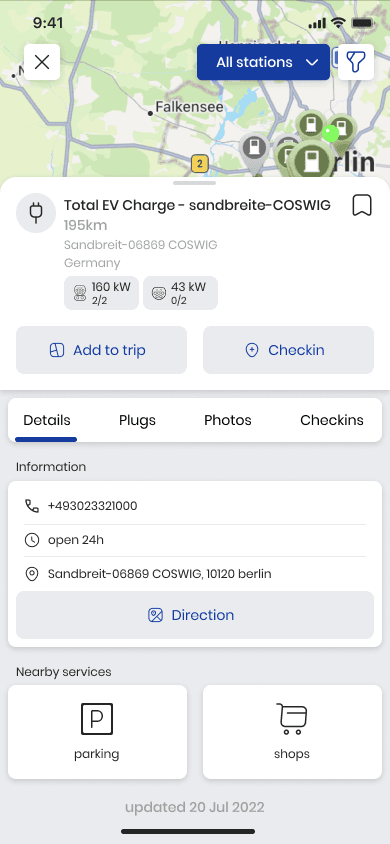
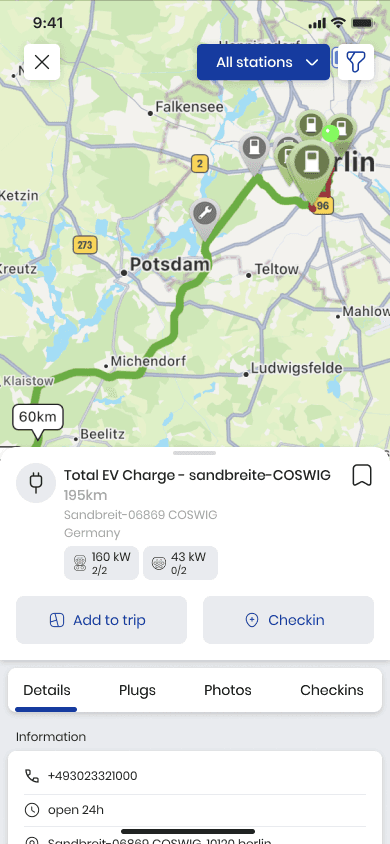
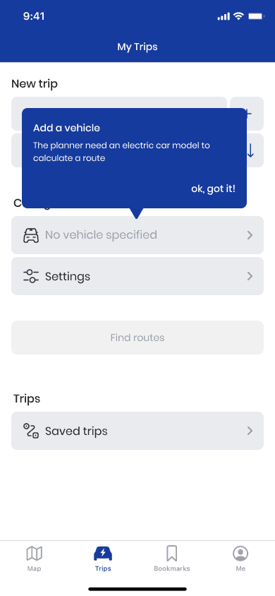
Many users struggled with understanding how to use key features within the app, such as filtering charging stations by their vehicle type or charging speed.
To address this, I implemented a clearer labeling system and introduced visual cues that would guide users more intuitively.

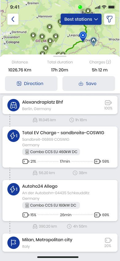
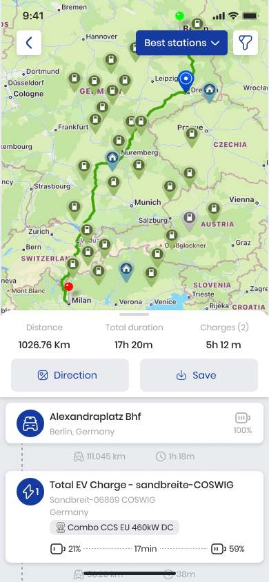
new design
old design
Help and Documentation:
The app lacked easily accessible help features, leaving users frustrated when they encountered problems.
A dedicated help section was introduced, along with a better FAQ page, to provide users with self-help solutions whenever they faced issues.
new design
Solutions and Redesign:
Consistent Design Language: I introduced a cohesive design language that applied consistent colors, typography, and visual hierarchy across all screens. This allowed users to feel more confident navigating the app while also improving the overall visual harmony.
Modernised Interface: The user interface was redesigned to feel more contemporary and user-friendly. Unnecessary elements were removed, making the app feel lighter and easier to navigate, especially when locating charging points.
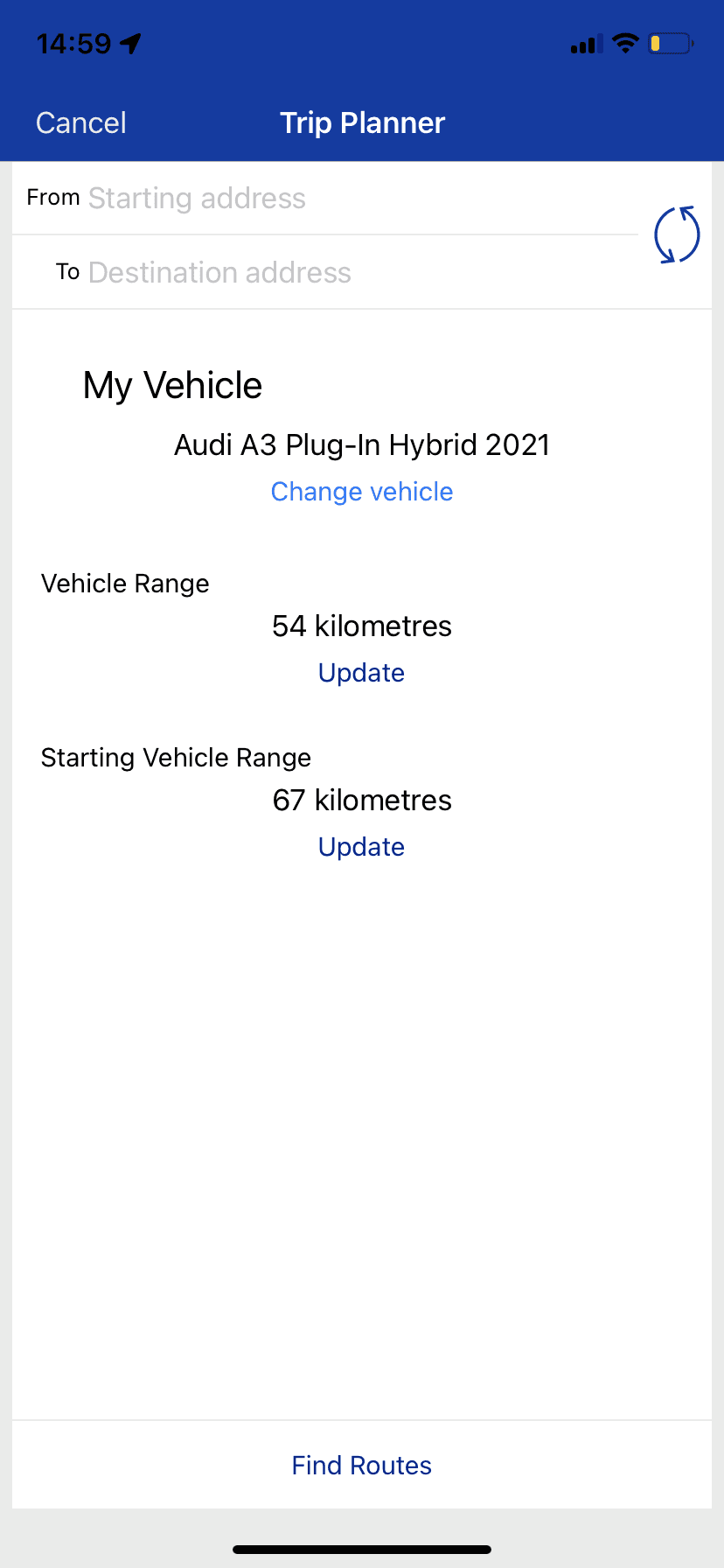
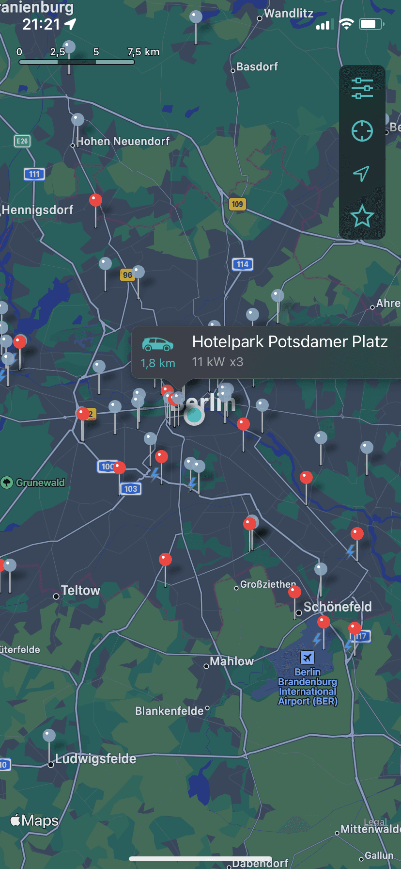
Better Navigation and Filters: I simplified the navigation and introduced clearer filter options so users could easily find charging stations that matched their vehicle specifications and location preferences. The design now includes a map with easily recognisable markers and filters for charging speed, station availability, and distance.
Enhanced Help and Documentation: A help section was added that contains easy-to-understand FAQs and step-by-step guides. This improved user support, empowering users to resolve minor issues on their own without needing external help.
User Testing and Feedback
The redesigned app was tested with real users who own electric vehicles, allowing me to gather valuable insights into how the new features and design impacted their overall experience. The feedback was overwhelmingly positive, particularly regarding the ease of navigation, improved filters, and consistent design.
User Flow Analysis: Conducted an in-depth examination of the Plugshare app to understand its current user flows.
Feature Research: Studied multiple articles to gain insights into user needs and preferences, ensuring the incorporation of the most valuable features.
Competitive Benchmarking: Compared the flows and features of popular applications such as Chargepoint, Pump, and ChargEV to identify best practices and areas for improvement.
Chargepoint

Pump
ChargEV
Result
The new design improved the user experience by making it easier to find charging stations, navigate the app, and access relevant information. Users reported higher satisfaction with the visual appeal and functionality of the app. The new filters, in particular, were seen as a game-changer for users who had struggled with the previous version.
Key outcomes include:
Faster Task Completion: Users were able to locate charging stations 20% faster with the simplified interface.
Reduced Errors: Fewer navigation errors were reported due to improved UI consistency and help documentation.
Increased Engagement: The app saw an increase in daily active users following the redesign, as users found it more enjoyable and intuitive to use.
Conclusion
This project taught me valuable lessons about the importance of consistency in design and the impact it has on user trust and usability. By addressing design flaws and improving navigation, the new Plugshare app became a more reliable and user-friendly tool for EV drivers. My work on this project showcased my ability to take a complex app and make it more accessible, efficient, and visually appealing.
Thank You
For Watching
Shima Ghasemi