
How We Boosted Engagement and Clickouts on Pepper by Simplifying Deal Discovery
Atolls Project (Pepper)
Discover how our redesign journey improved user engagement and clickouts on Pepper. By addressing user pain points through research, A/B testing, and iterative design, we achieved a streamlined experience for guest, new, and registered users. See the results and insights that shaped the transformation!
A Story of Growth
After implementing our changes, here’s how the numbers spoke for themselves:
Guest Users:
Views improved by 5.62%.
Clickouts increased by 3.04%.
New Users:
Views jumped by 4.08%.
Clickouts rose by 2.51%.
Registered Users:
Views went up by 2.54%.
Clickouts grew slightly by 0.41%.
The standout improvement? More clickouts on the “Get Deal” button in the listing page, making it clear that the redesign successfully streamlined user engagement where it mattered most.
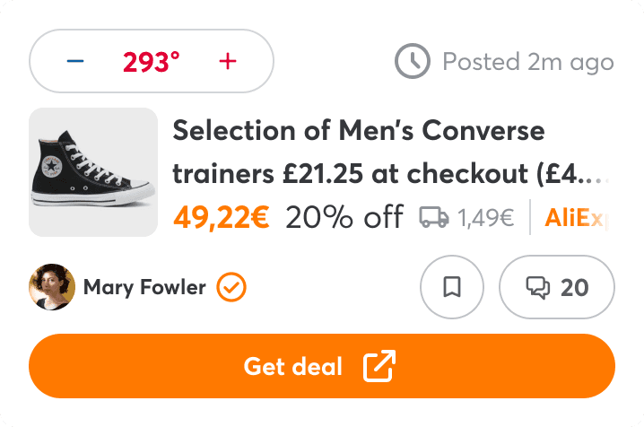
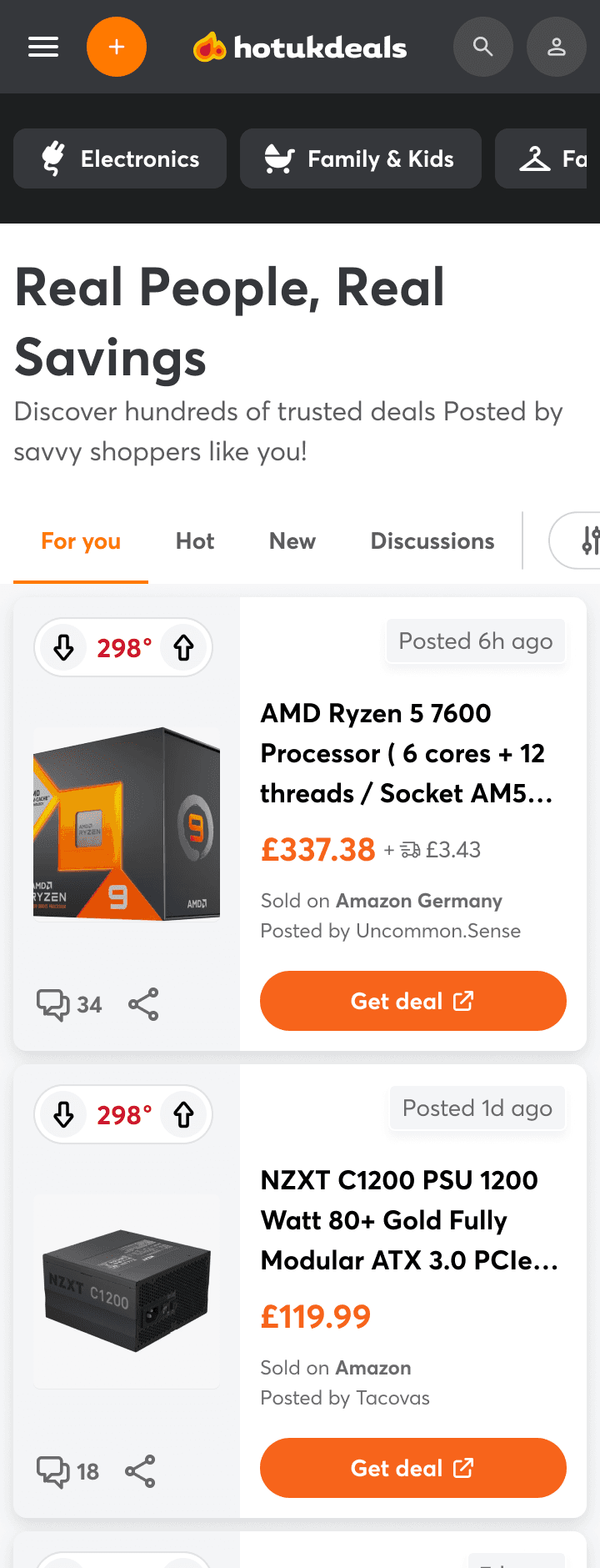
Old UI
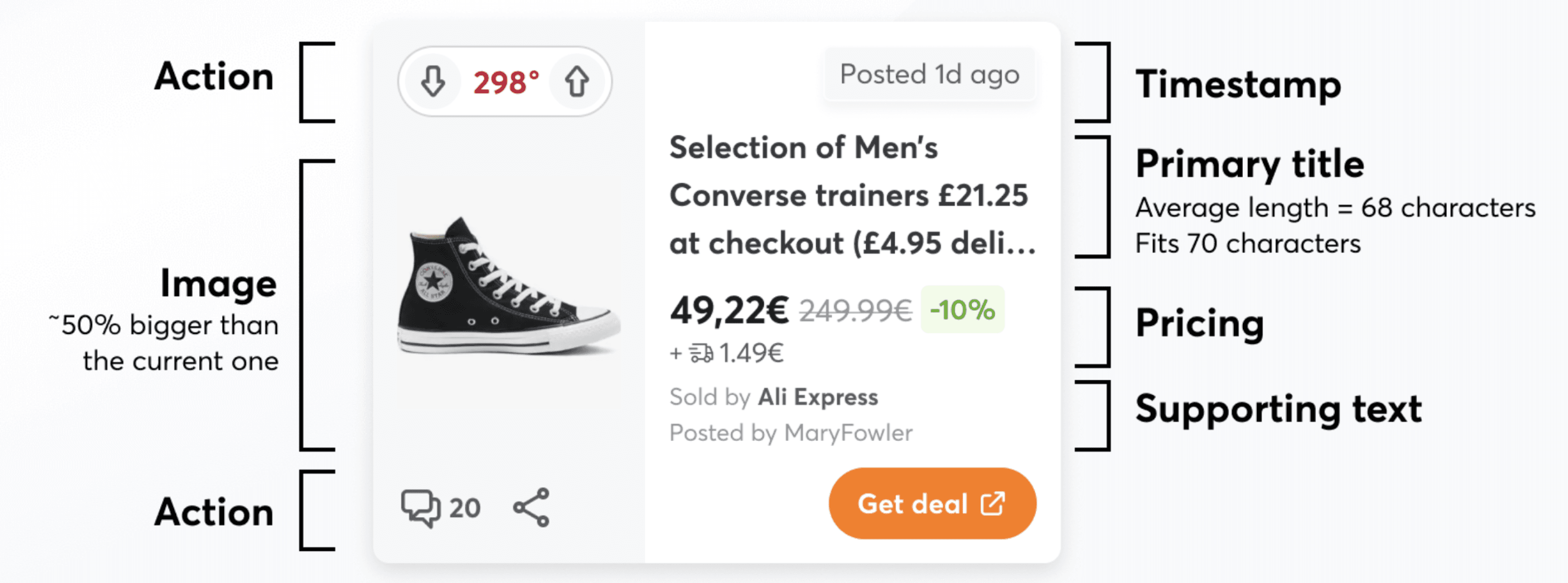
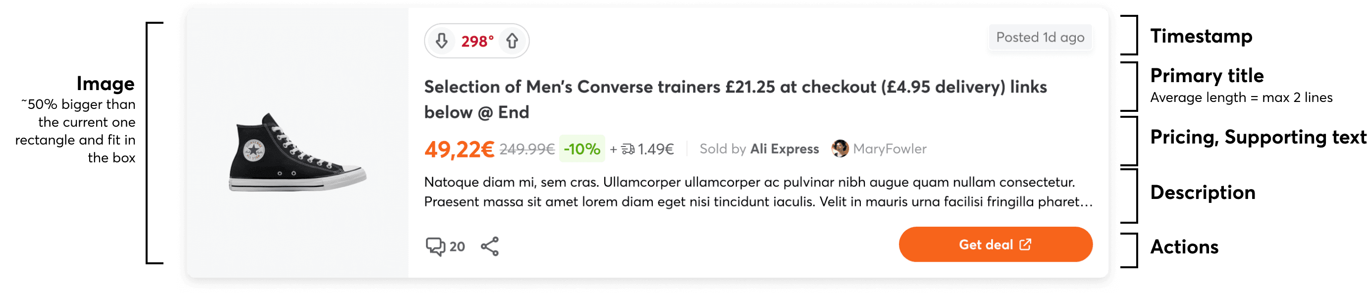
New UI
The Journey to These Results
The Goal
We aimed to increase user engagement and clickouts—focusing on helping users find and act on deals more effectively. Whether they were new users, guests, or registered users, we wanted every interaction to feel seamless, intuitive, and valuable.
Understanding the Problem
Our users fell into three key groups, each with its own challenges:
Guest Users: Curious browsers often confused by hidden details or unclear navigation.
New Users: Fresh faces struggling to understand features like “temperature” or compare prices across stores.
Registered Users: Loyal users frustrated by unclear timestamps, hidden store names, or complex deal flows.
Across the board, users reported these key pain points:
Temperature Confusion: A social metric that wasn’t intuitive for new users.
Hidden Information: Store names and prices were often cut off, especially on mobile.
Unclear Costs: Shipping fees weren’t separated from the total price, causing confusion.
Navigation Frustrations: Users missed key buttons or didn’t understand deal flows, leading to misclicks.
How We Solved It
Through research and testing, we pinpointed what needed to change:
Research-Backed Insights:
Card Sorting: Users ranked elements like images, titles, and store names by importance.
Usability Testing: We observed where users got stuck and why.
A/B Testing: We experimented with button placements, layouts, and hierarchy to understand what worked.
Surveys: Users shared their initial impressions and frustrations.
What We Changed:
Simplified Deal Cards: Highlighted key details like images, prices, and store names for quick scanning.
Clarified Timestamps: Added labels like “Posted 6 hours ago” for clarity.
Improved Navigation: Introduced a “Learn More” button alongside the “Get Deal” button to guide users to more information before taking action.
Separated Merchant Details: Clearly distinguished between “Shared by” (deal submitter) and “Sold by” (merchant).
Iterative Testing:
First A/B Test: Removing the “Get Deal” button from the listing showed that new users clicked 28% more, but guest and registered users clicked 18-19% less—highlighting different needs for each group.
Second A/B Test: Adding a “Learn More” button improved guidance for new users but didn’t significantly affect overall engagement.
What Worked Well
Clarity is King: Larger images, clear titles, and better placement of store names made deals easier to understand.
Quick Scanning: Prominent details like shipping costs and prices helped users trust and engage with deals.
Navigation Simplified: Separating merchant and submitter names avoided confusion, especially on mobile.
What Needs More Work
Temperature Concept: Still confusing for new users; we plan to iterate with clearer visual cues.
Wording Improvements: Labels like “Shared by” and “Sold by” need clearer phrasing.
Timestamps: Need to be more intuitive for quick understanding.
Key Takeaways
This journey wasn’t just about numbers—it was about understanding how users engage and addressing their pain points. By listening, experimenting, and iterating, we achieved tangible improvements across all user groups.
The result? A platform where users can find, trust, and act on deals with confidence. And we’re just getting started.
Contact me: shimaghasemi36@gmail.com