
UX challenge
Enhancing User Retention in Too Good To Go App
motivation
Introduction
The situation is…
In today’s fast-paced world, reducing food waste is more crucial than ever. Too Good To Go, a leading app in food sustainability, has successfully connected users with surplus food from local businesses. However, the app faced challenges in retaining users and keeping them engaged long-term. This project focused on enhancing user retention by redesigning key app features, including challenges, rewards, and a loyalty program.
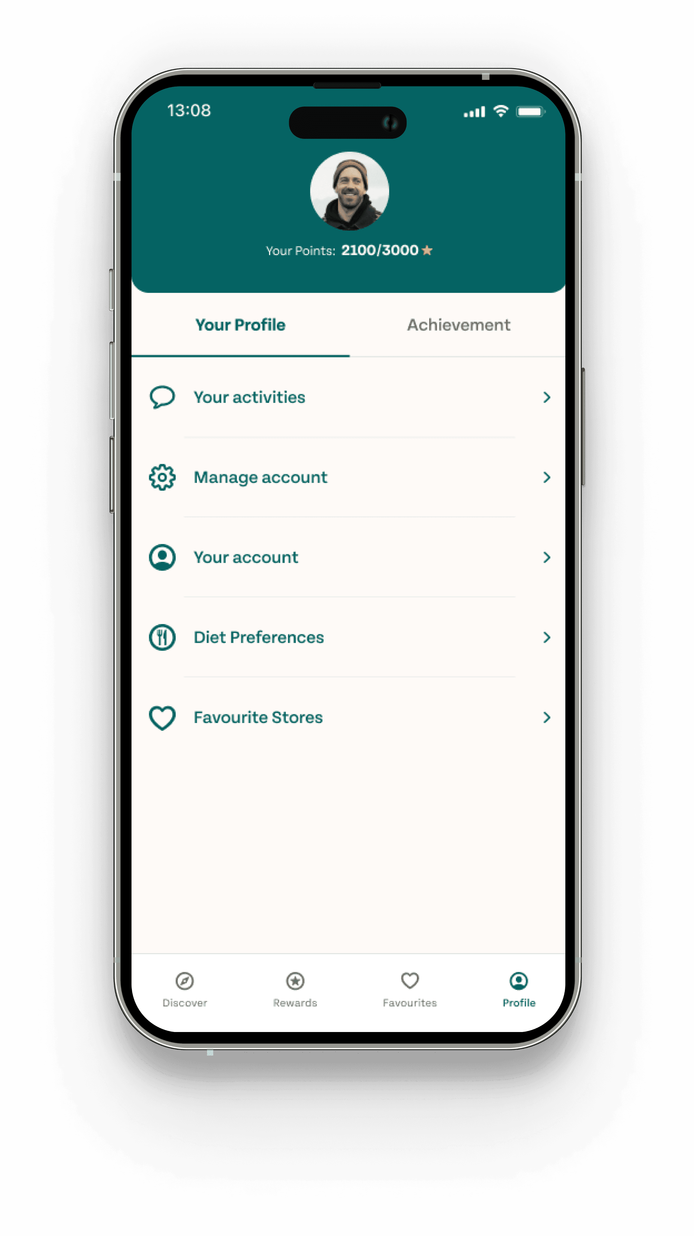
My role
I contributed to the overall design process and oversaw aspects related to product scoping, user flows, wireframe, rapid prototyping, and usability testing.
Additionally, I conducted user research, facilitated co-workshops, and contributed in synthesising research findings to produce viable ideas.
Team
2 Product designer, 1 UX mentor
Tools
Figma, Lookback, illustrator
Duration
5 weeks
problem Discovery
Tackling user engagement drop-offs
Despite a growing user base, TGTG experiences a significant drop-off in user engagement after initial usage. Users are not consistently returning to the app, leading to lower retention rates and missed opportunities for reducing food waste.
Our solution
A series of targeted UX/UI enhancements that increase user retention, resulting in more frequent app usage and higher engagement rates.
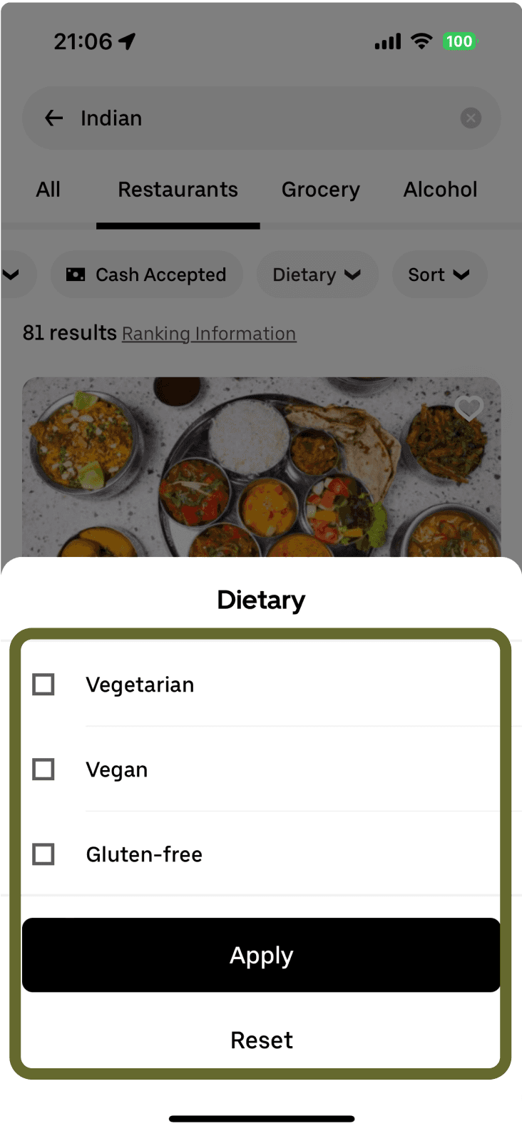
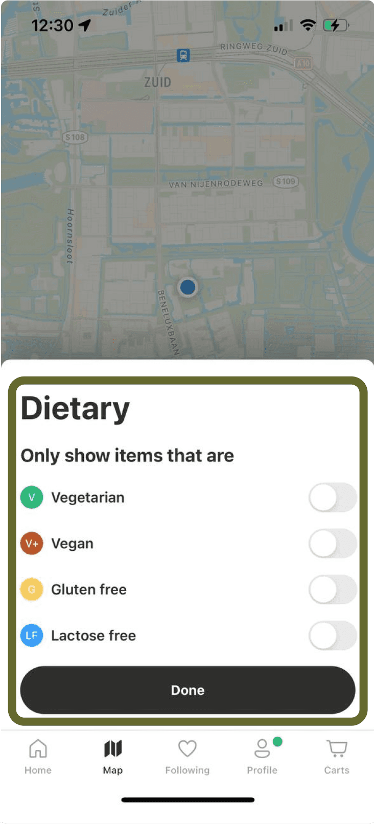
• Improve Search Functionality: Add dietary filters, categories and tags for quick access to specific food options
• Loyalty Program: Launch a loyalty program where users earn and redeem points for perks.
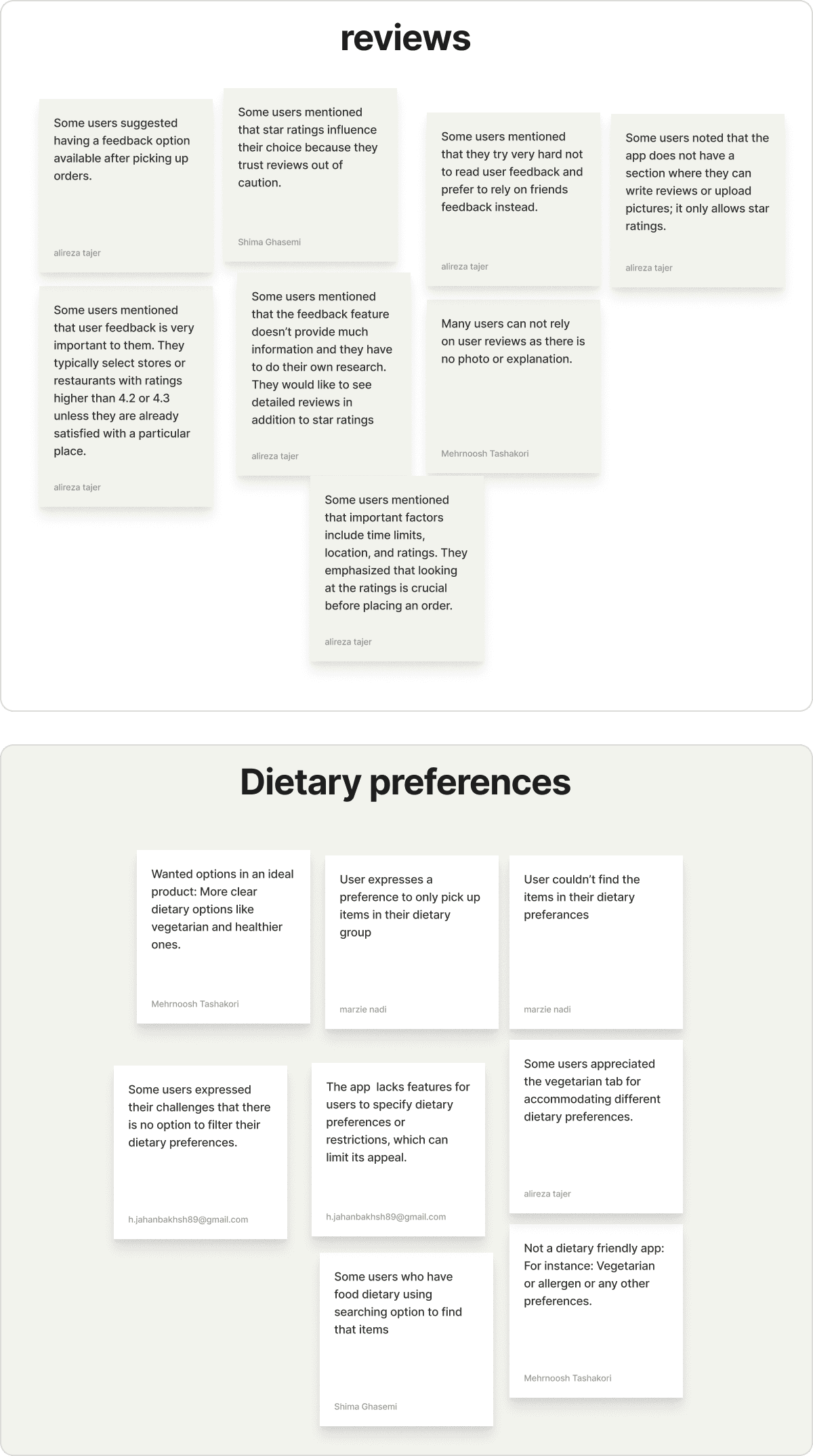
• Feedback Focus: Incorporate user reviews and a structured feedback form to capture genuine insights.
• Flexible Pickup: Extend hours and offer more pickup/delivery times for user convenience.
The Product
Home Screen
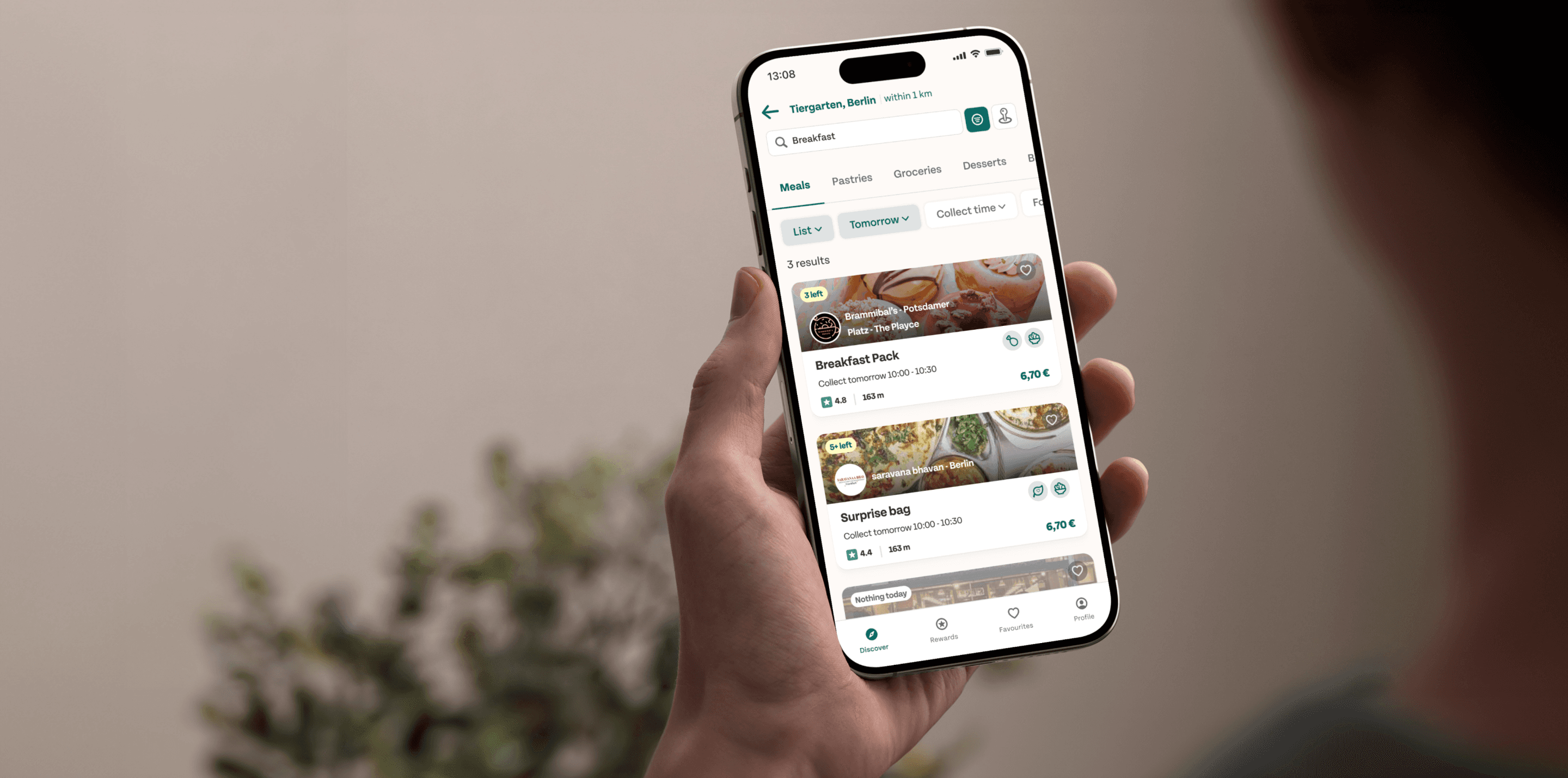
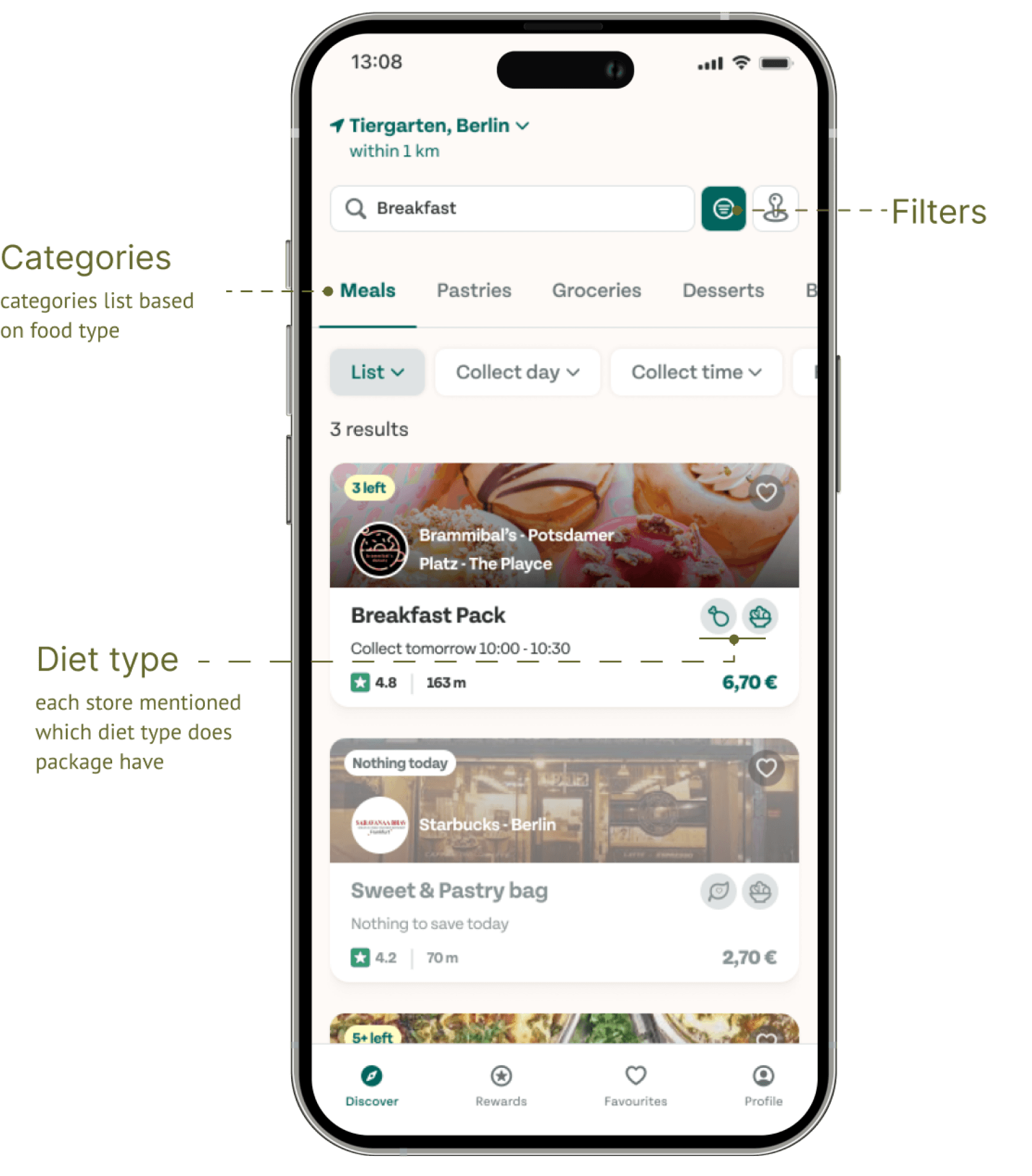
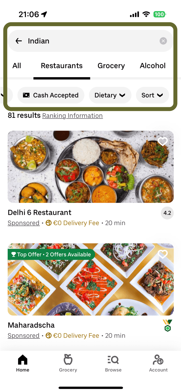
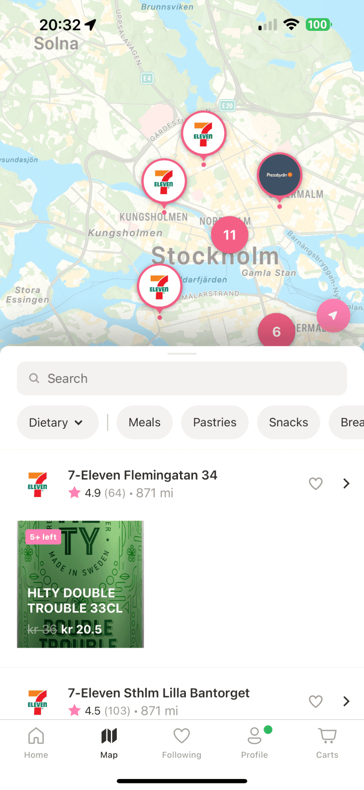
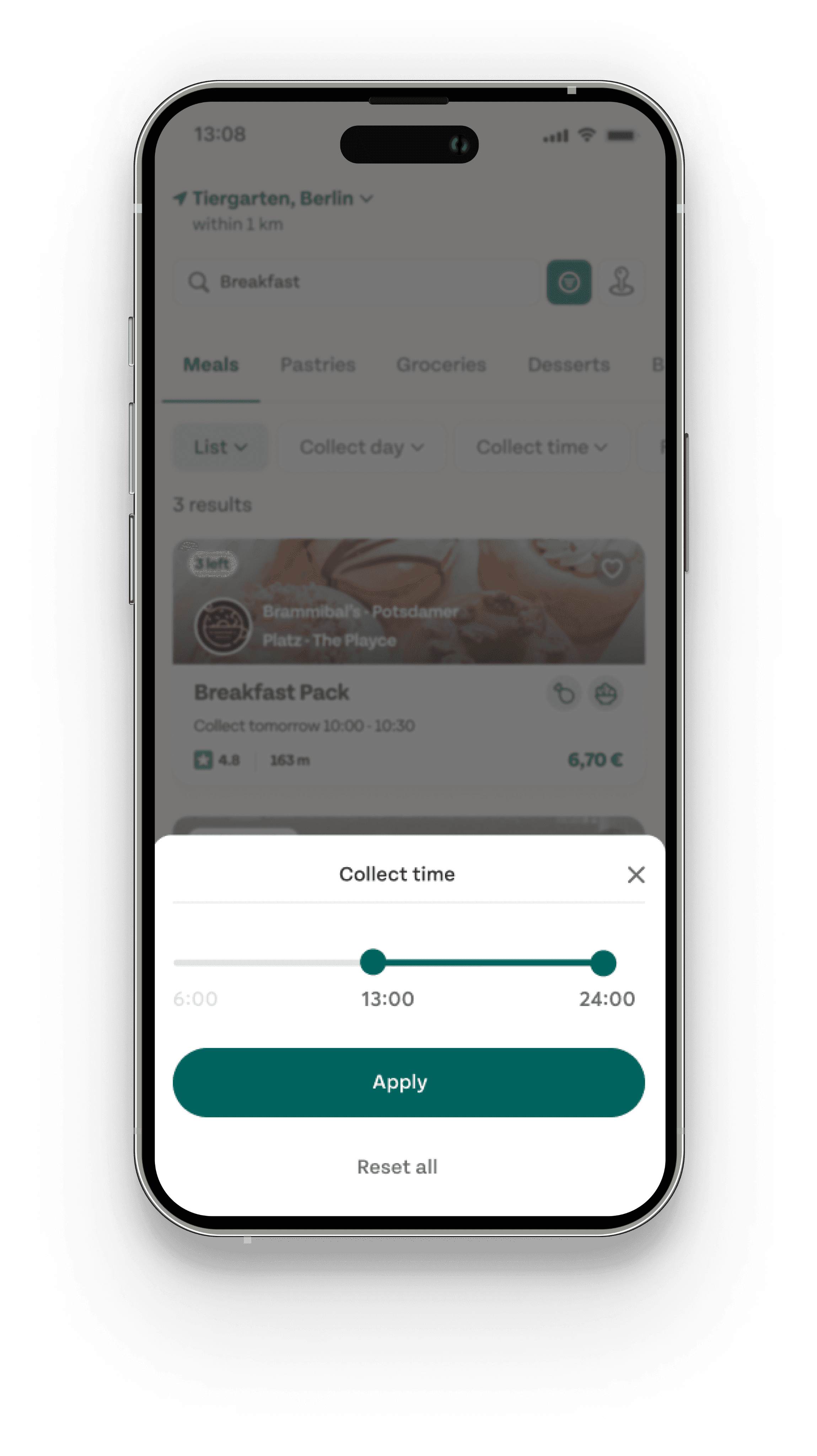
Streamlined Search & Filters: We’ve moved the search box, filters, and map directly to the browser page for easier navigation. Users can now quickly categorize lists by food types (Meals, Pastries, Groceries) and use filters to refine their search. Diet icons are added to each package, allowing for quick identification of dietary preferences. These updates make the experience more intuitive and personalized.
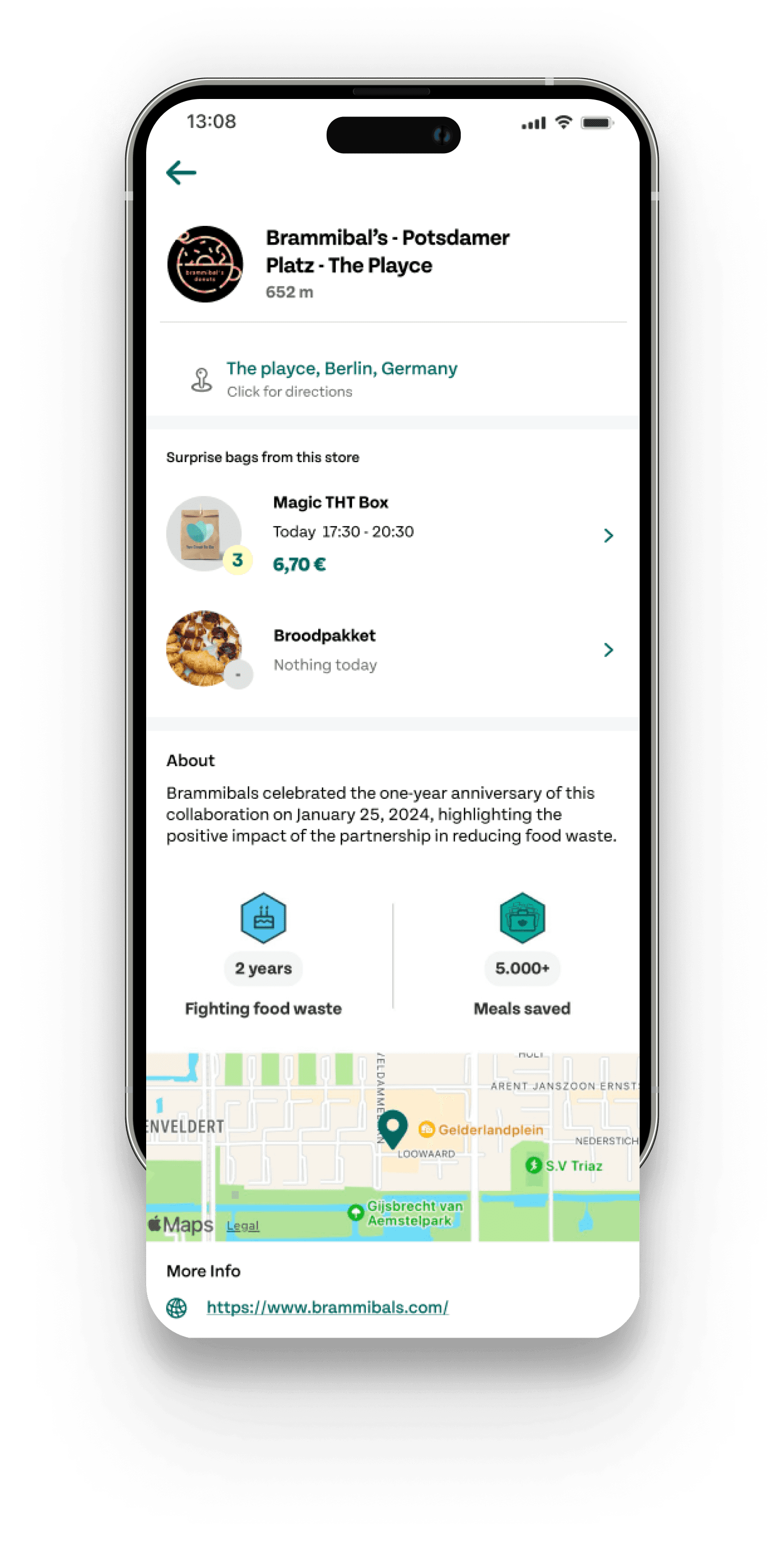
Product page
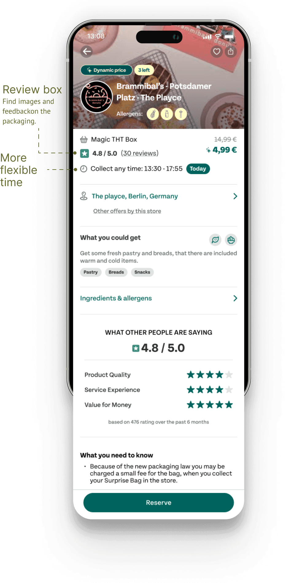
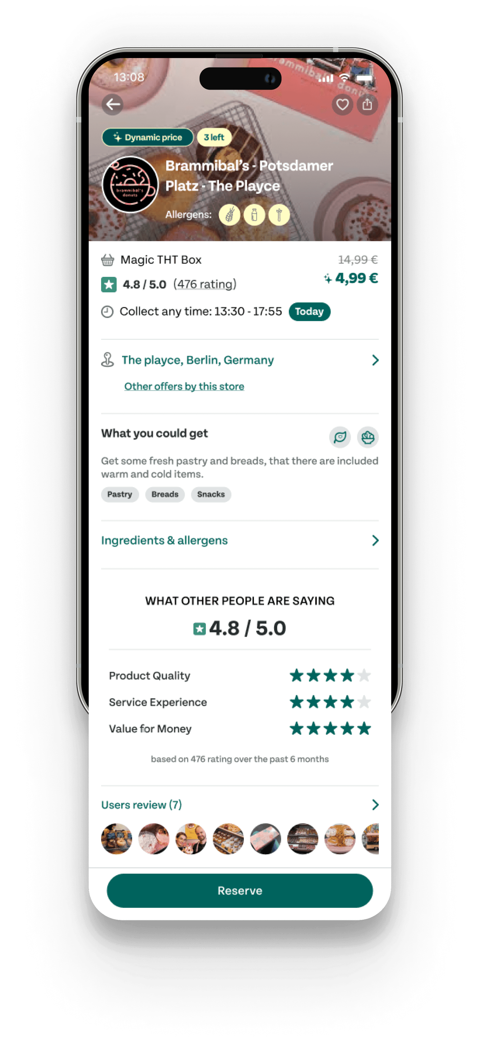
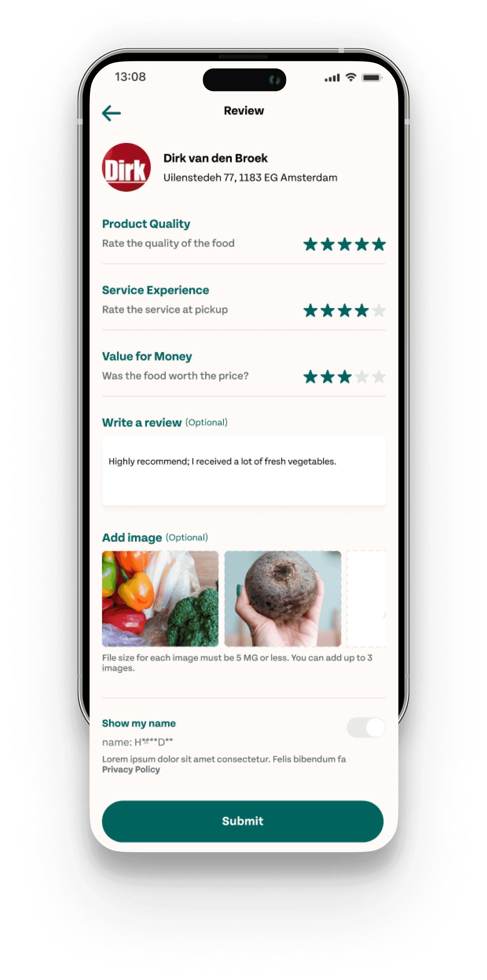
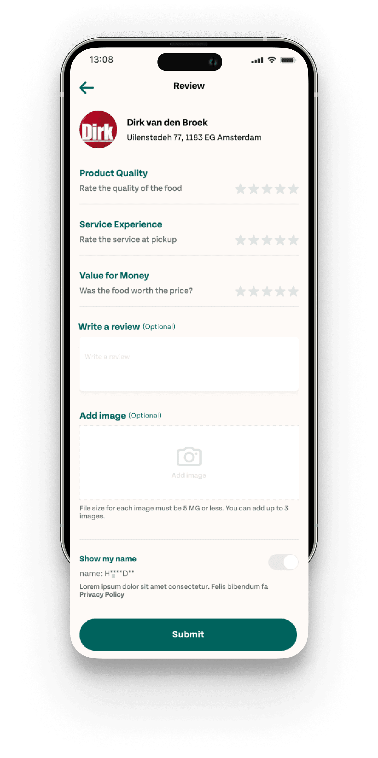
Flexible Pickup & Enhanced Reviews: We’ve introduced flexible pickup times for better user control. The package list has been made more prominent for improved visibility and understanding. A new review box highlights user feedback with ratings, reviews, and images, offering insights to help users make informed decisions.
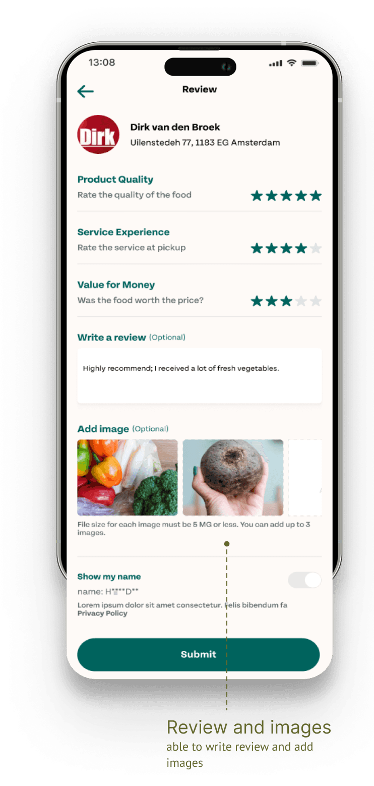
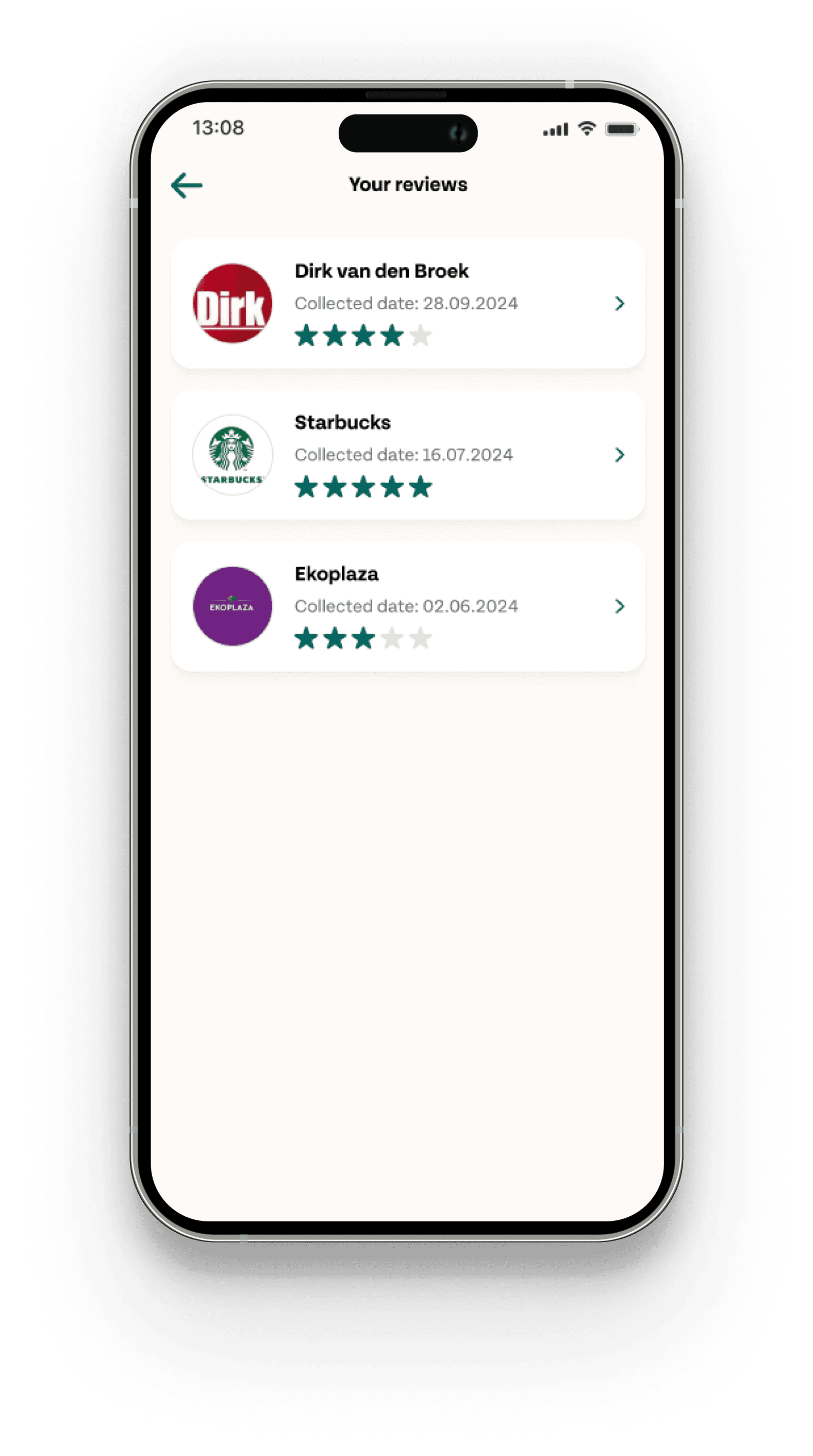
Reviews & feedbacks
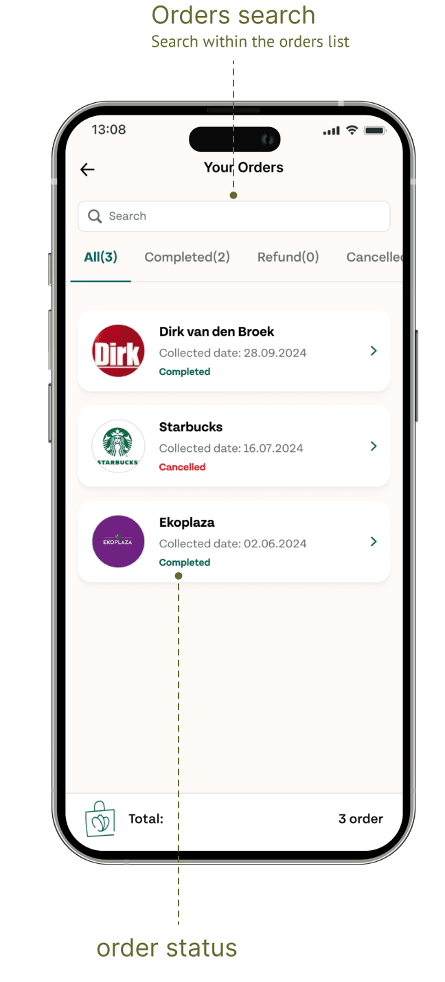
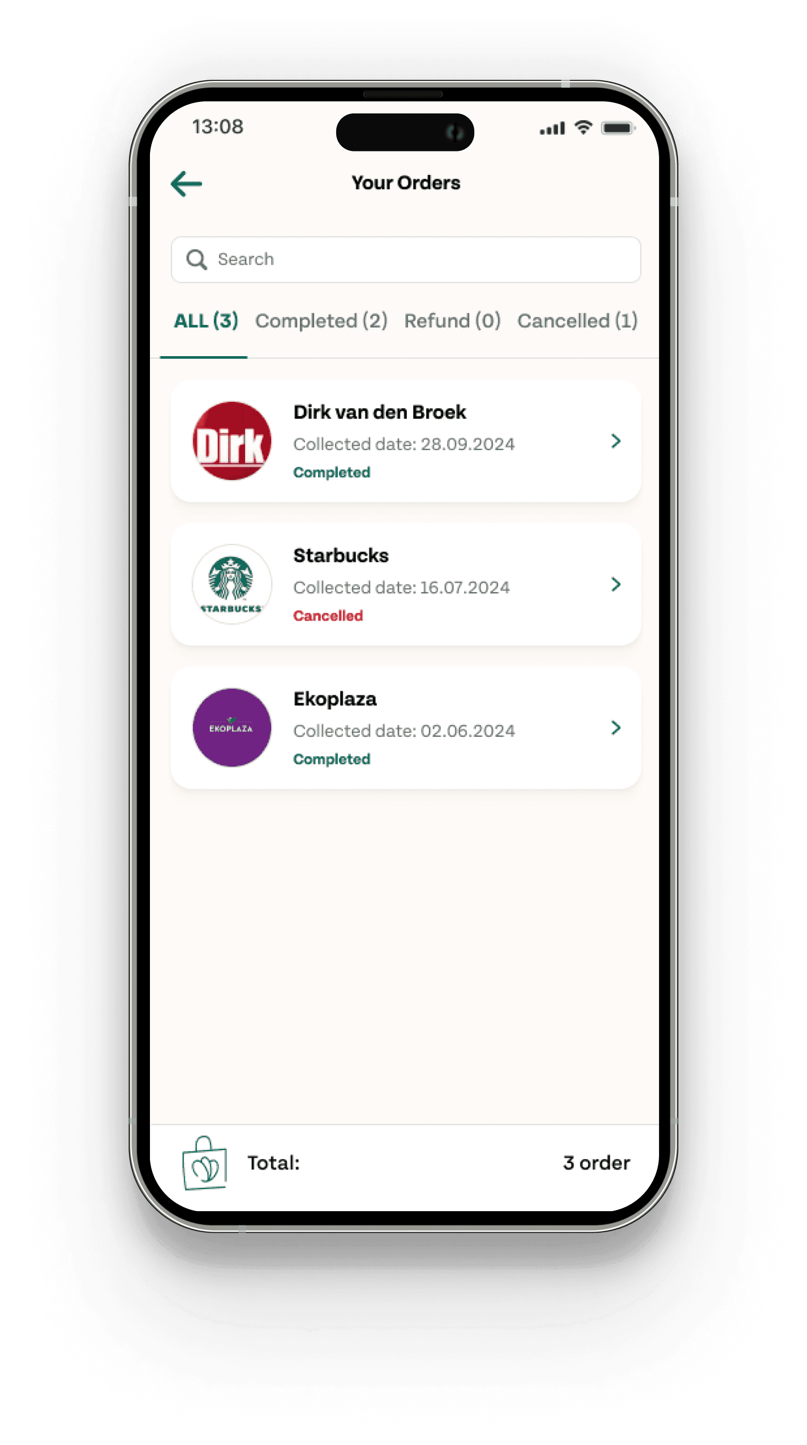
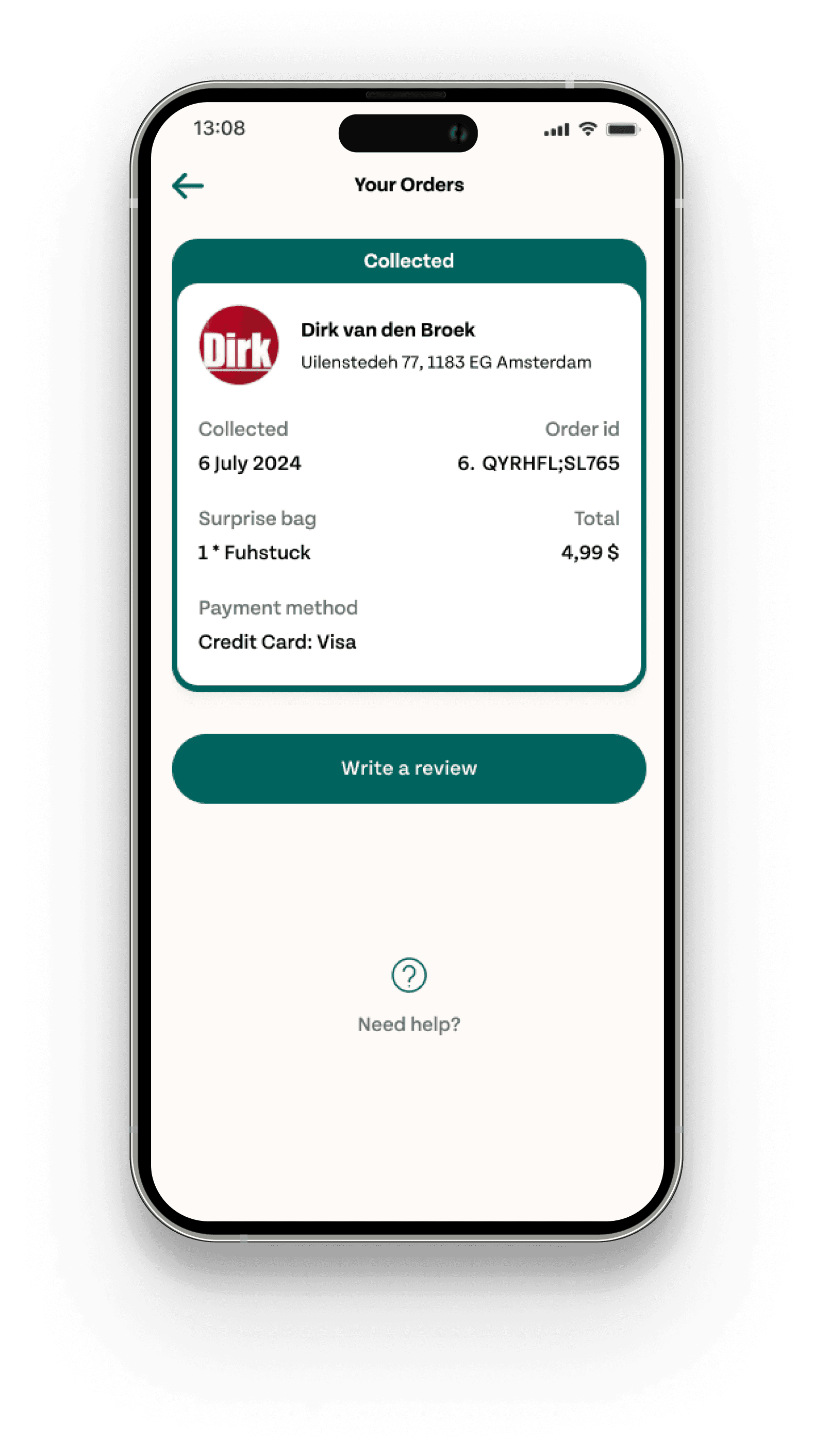
Order Management & Feedback Integration: We’ve introduced an order list feature for better package tracking. Users can now add feedback and upload images directly from their orders. Additionally, a comprehensive review list on the profile page allows users to manage all their reviews in one place, keeping them informed and engaged.
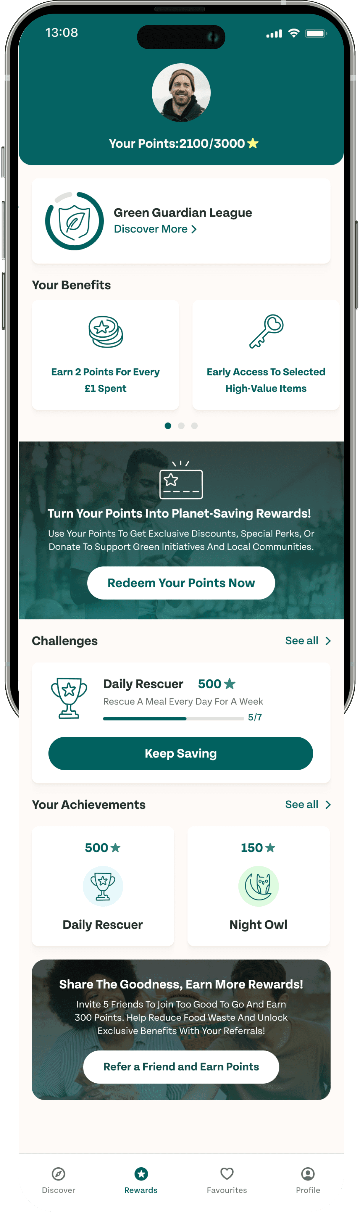
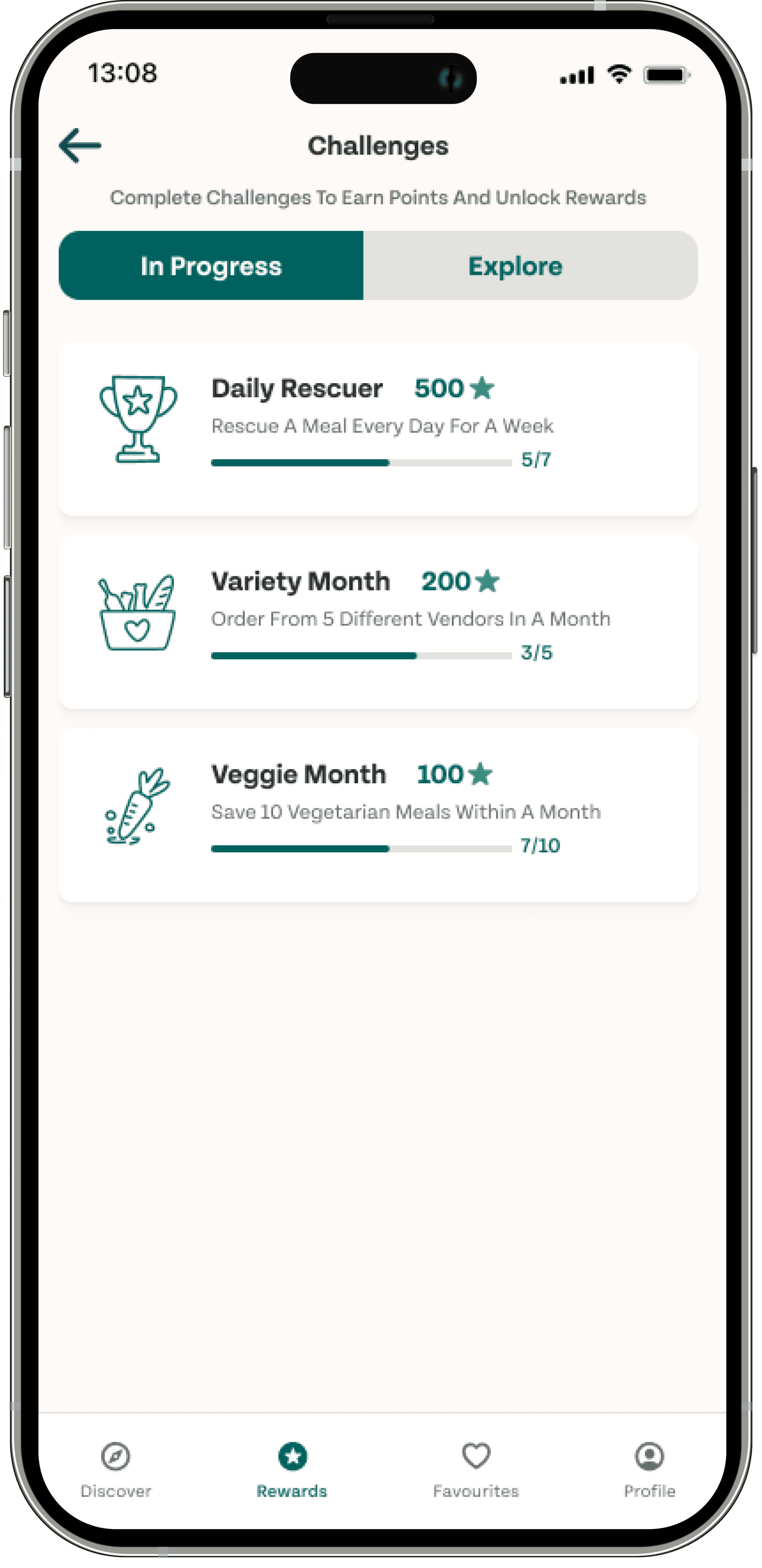
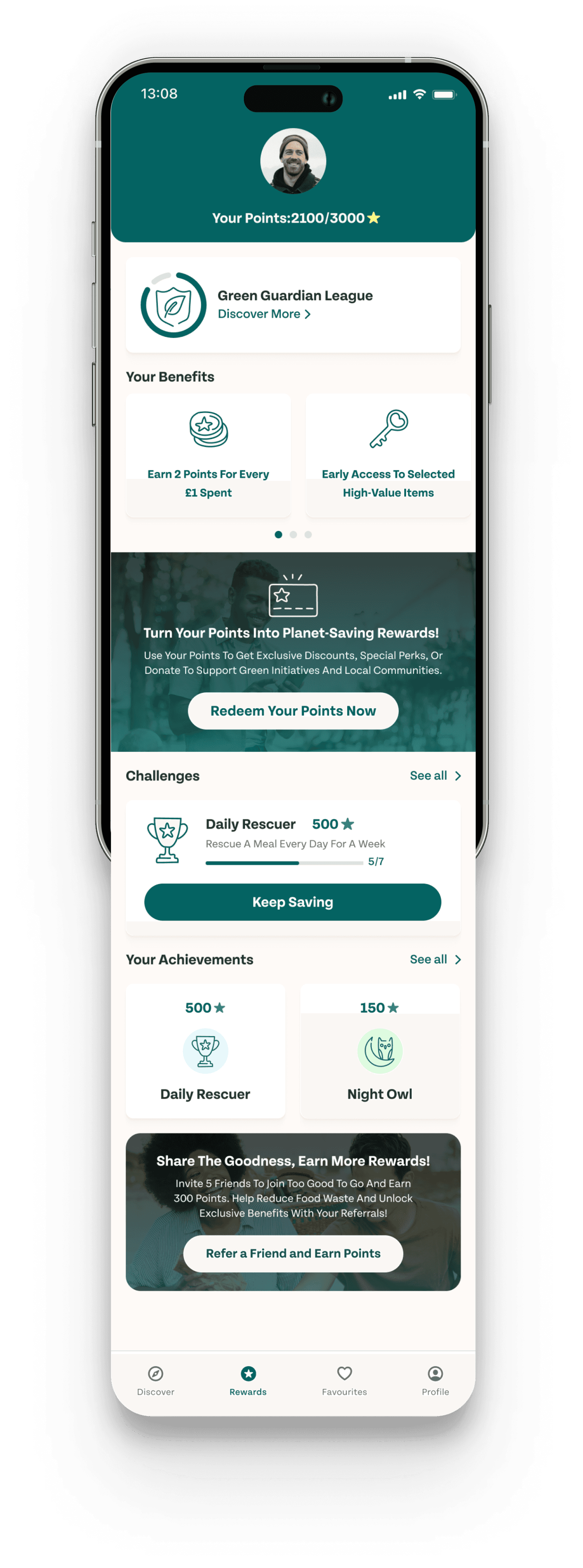
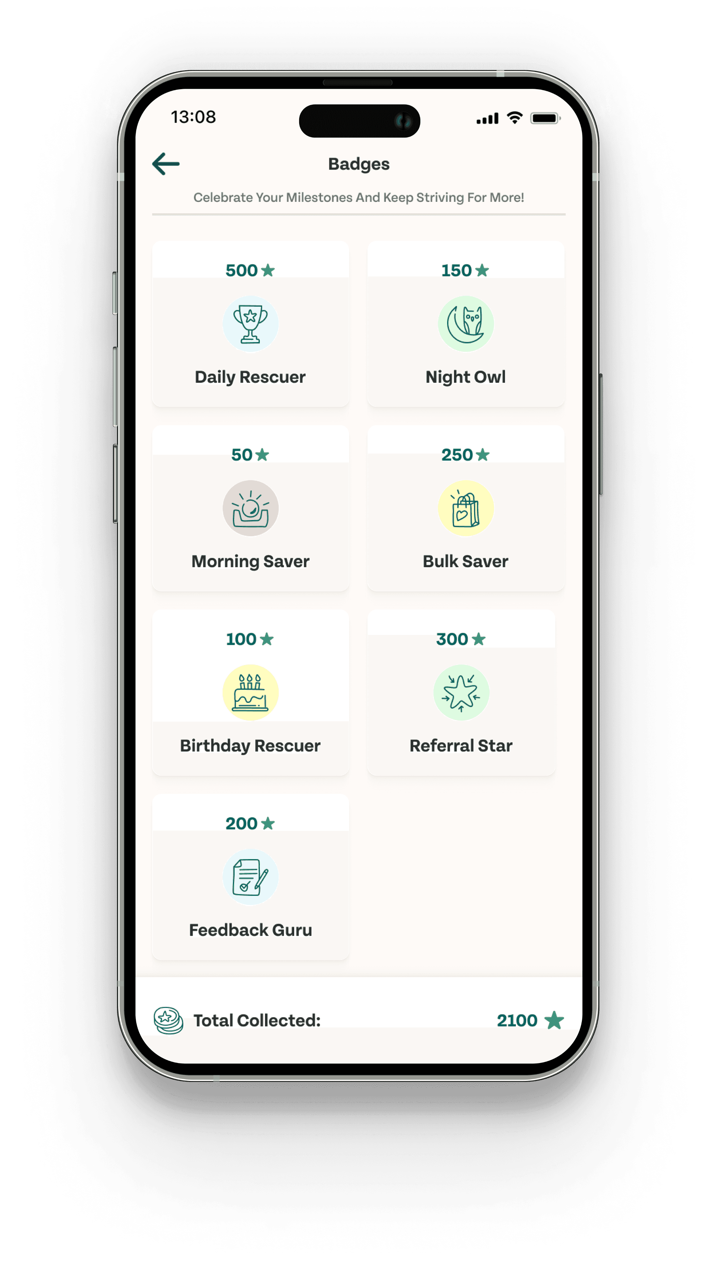
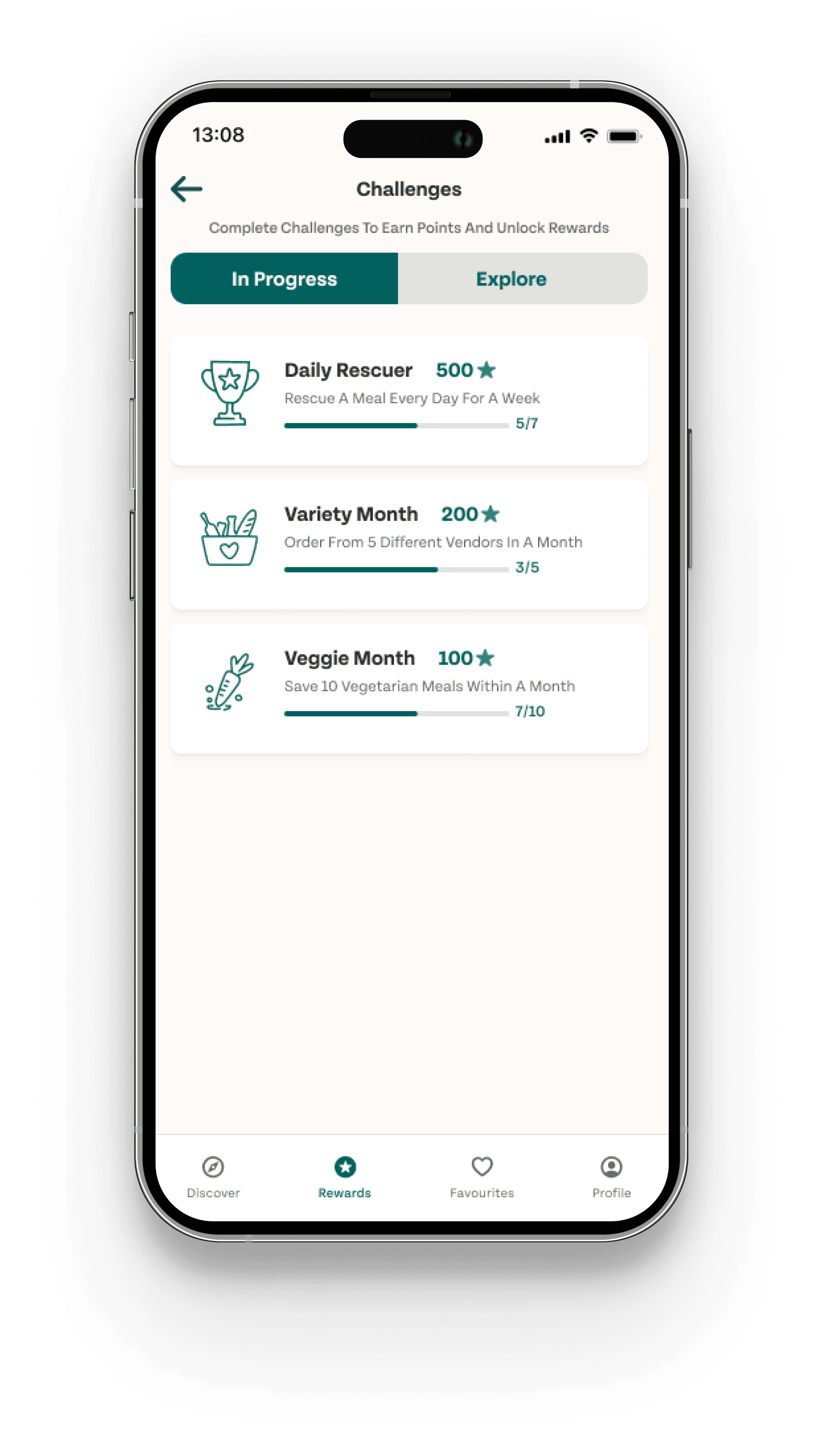
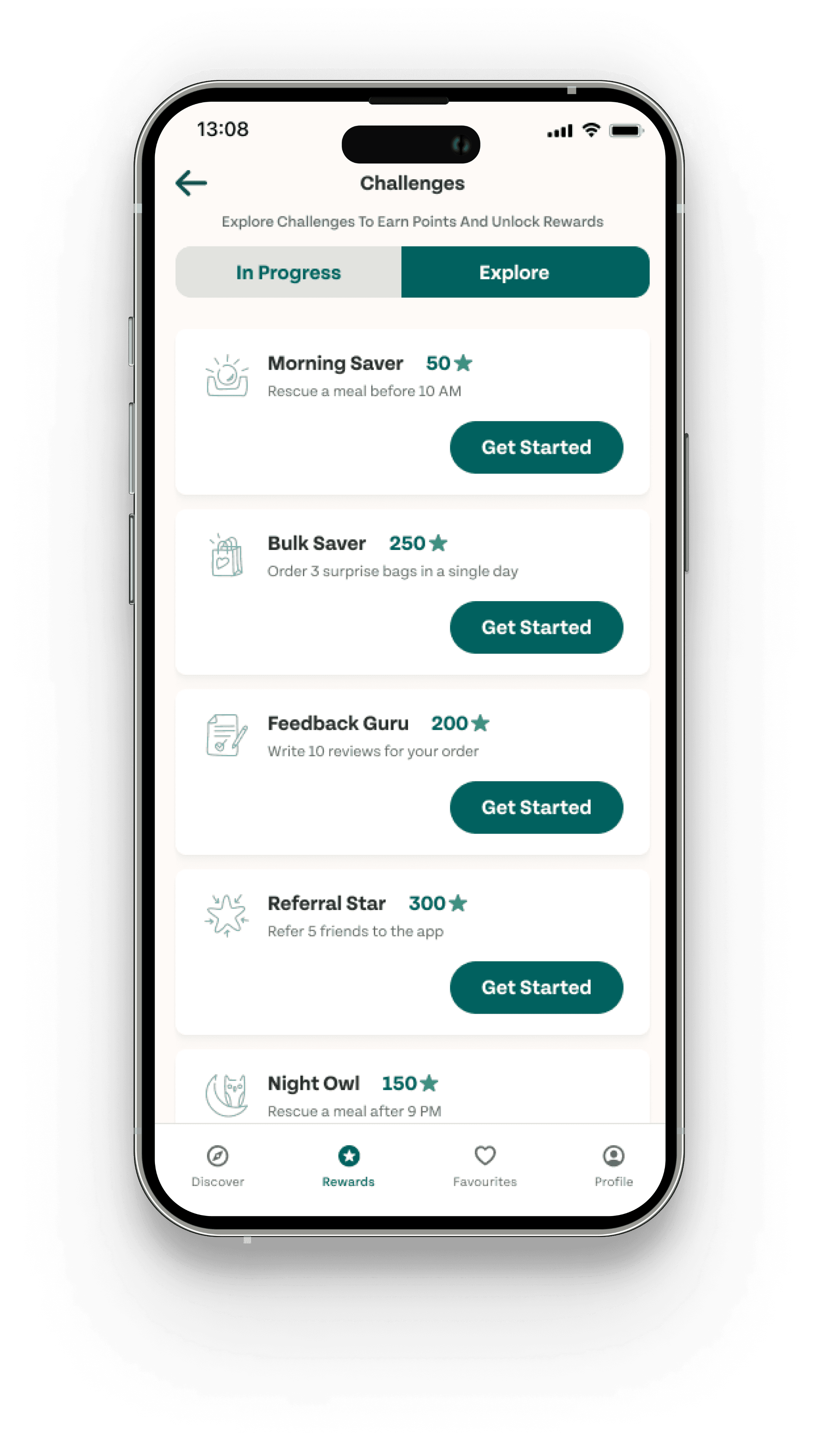
Gamification and Rewards
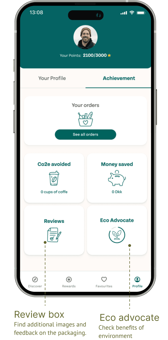
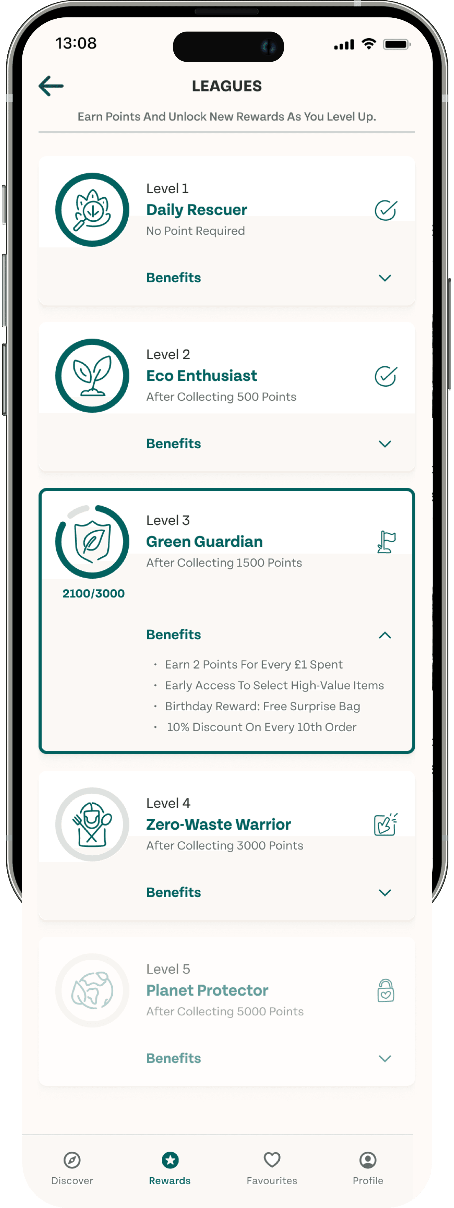
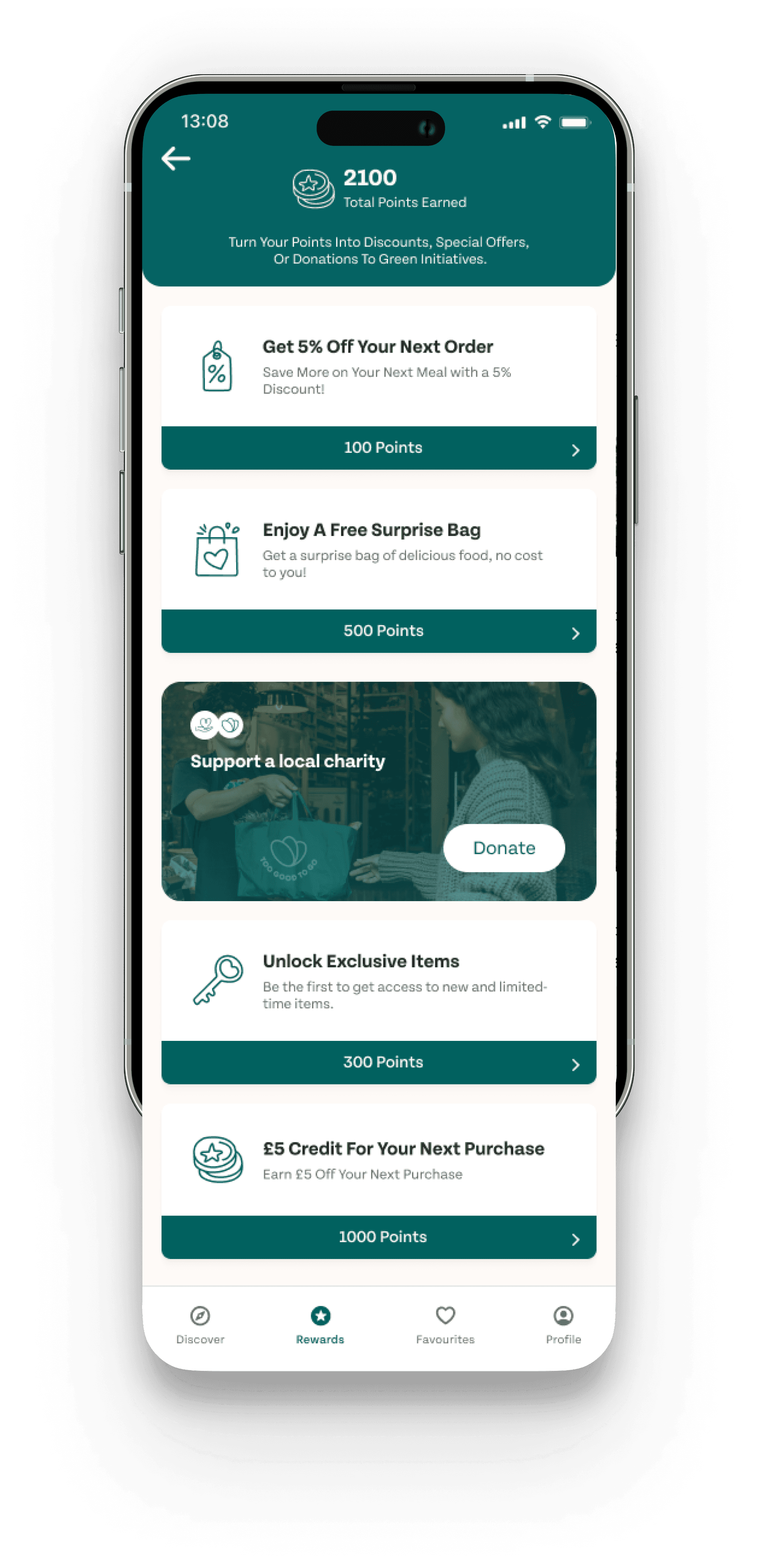
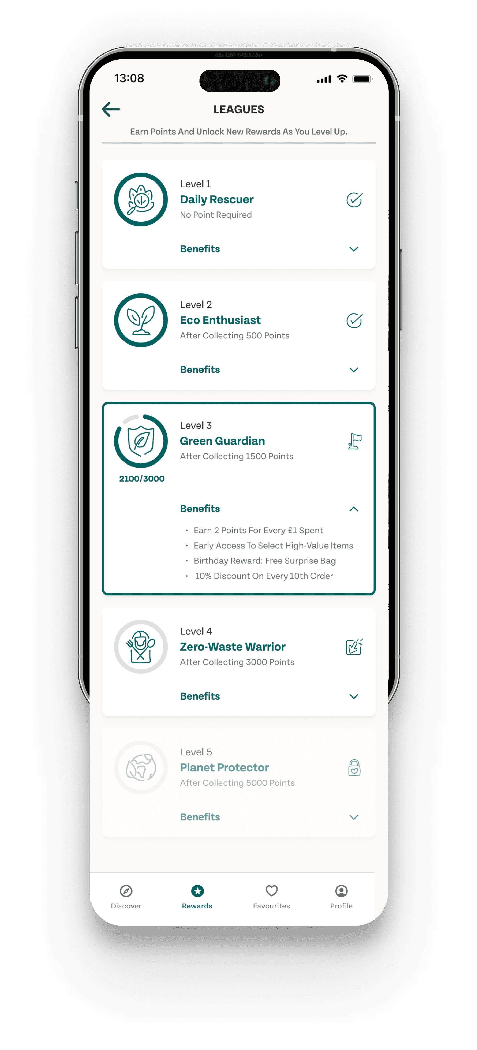
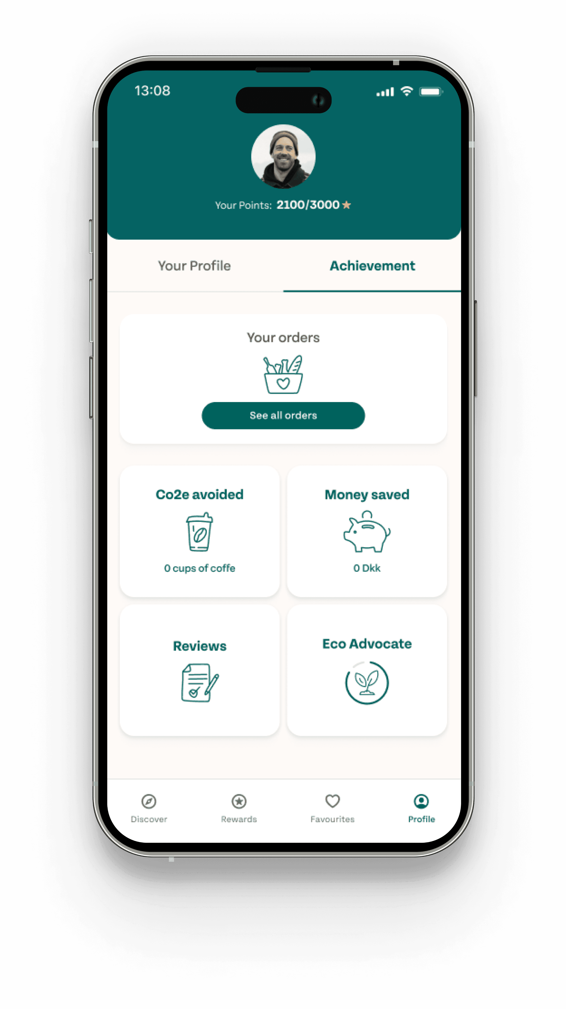
Loyalty Program Overview: The loyalty program is designed to enhance user retention by introducing a tiered system of engagement. Users progress through five levels—Fresh Finder, Eco Enthusiast, Green Guardian, Zero-Waste Warrior, and Planet Protector—by accumulating points. Each level offers increasing rewards and benefits, motivating users to stay active on the app. Challenges and badges further encourage participation by offering additional points and recognition for completing specific tasks, while the rewards system allows users to redeem points for discounts, special offers, and exclusive items.
Understand
Researching problem state
Discovery
We started our research by gathering valuable insights directly from the app’s users. This involved conducting user interviews and analyzing app store reviews to pinpoint pain points and opportunities for improvement. Our findings highlighted key challenges, particularly a lack of motivation among users to stay engaged with the app. This insight was crucial in shaping our approach to enhance user retention.
During our research, we explored the following questions:
What are the main challenges that users are facing?
How often do they use the app?
What details are most important to users when placing an order?
Was there anything that made the app difficult for them to use?
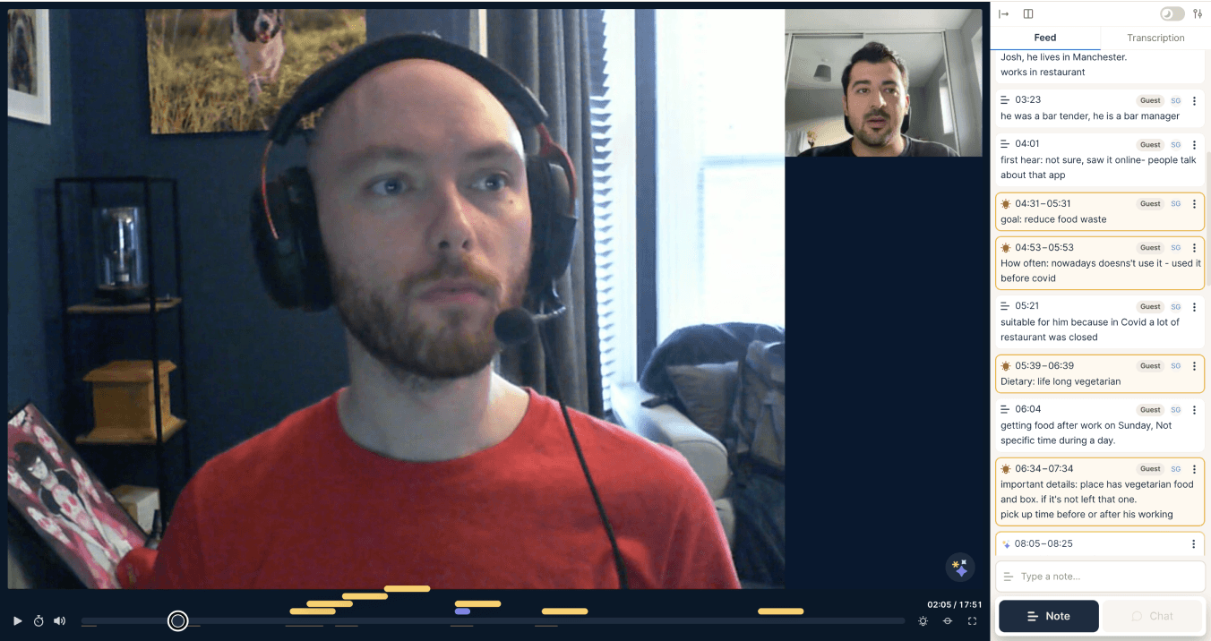
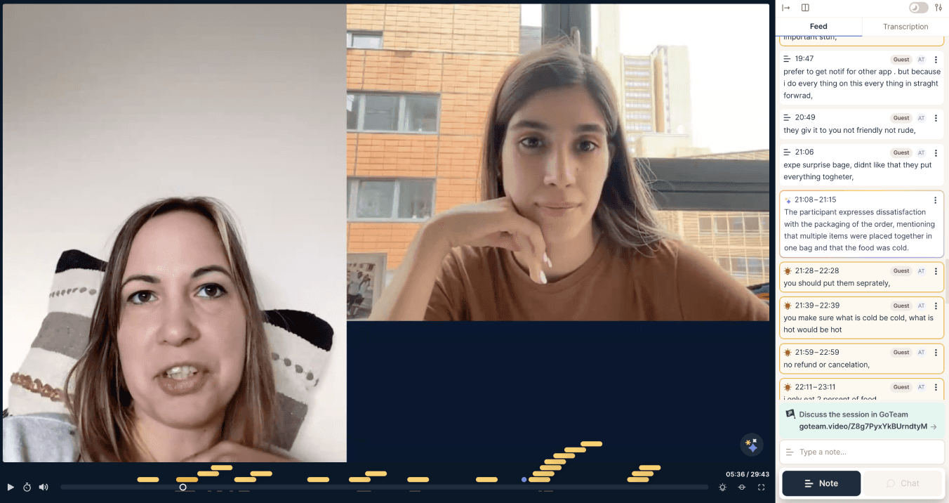
Taking a Deep Dive
“To validate our initial hypothesis and uncover user pain points, we conducted interviews with five existing app users. Additionally, we performed desk research to gather and analyse existing data from various sources.”
Desk research
What users say in reviews…
Based on existing data from various sources on the current app reviews
I keep getting suggestions for food I don’t like or can’t eat because of my dietary restrictions. The recommendations need to be more personalized.

lack of dietary food recommendation
Refunds take forever! I had to wait weeks to get my money back after a mix-up with an order. The process is too slow and frustrating.

delays in the refund process
I spent way too much time trying to find a store that had what I needed. The filtering options are so limited, and I couldn’t sort by what I was really looking for.

poor filtering options
I ordered a surprise bag, but I couldn’t find any details about allergens or ingredients. It’s risky for someone with food allergies like me.

lack of detailed food information
User interview
What users say…
This is what we discovered from the user interviews.

Not diet-friendly…
"Without clear dietary options like vegetarian
or allergen-friendly choices, this app falls short
of being diet-friendly."


Difficulty finding ideal products…
"Lack of clear dietary options, like vegetarian
and healthier alternatives, made it difficult for
me to find my ideal products."
When I' was in a hurry…
"It’ was challenging to find something suitable
without more detailed information about
the contents."

To align with my healthier choices…
"I found the high sugar content of the
available food options to be misaligned
with my preference for healthier choices,
which led me to stop using the app."
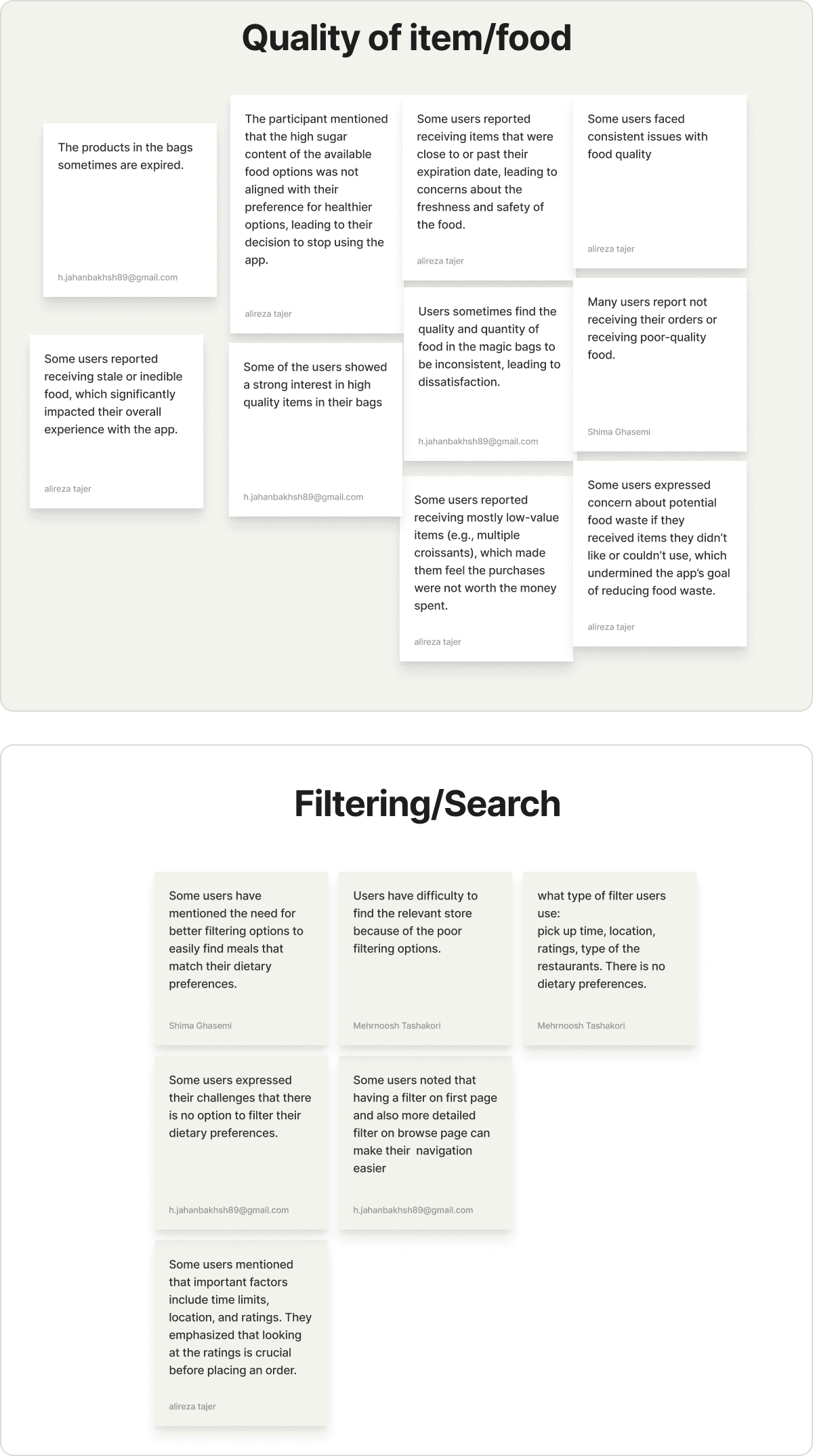
Affinity diagram
The common challenges for users
We organized and grouped the data coming from user interviews and desk research.
identify &synthesize
User personas
The life of...
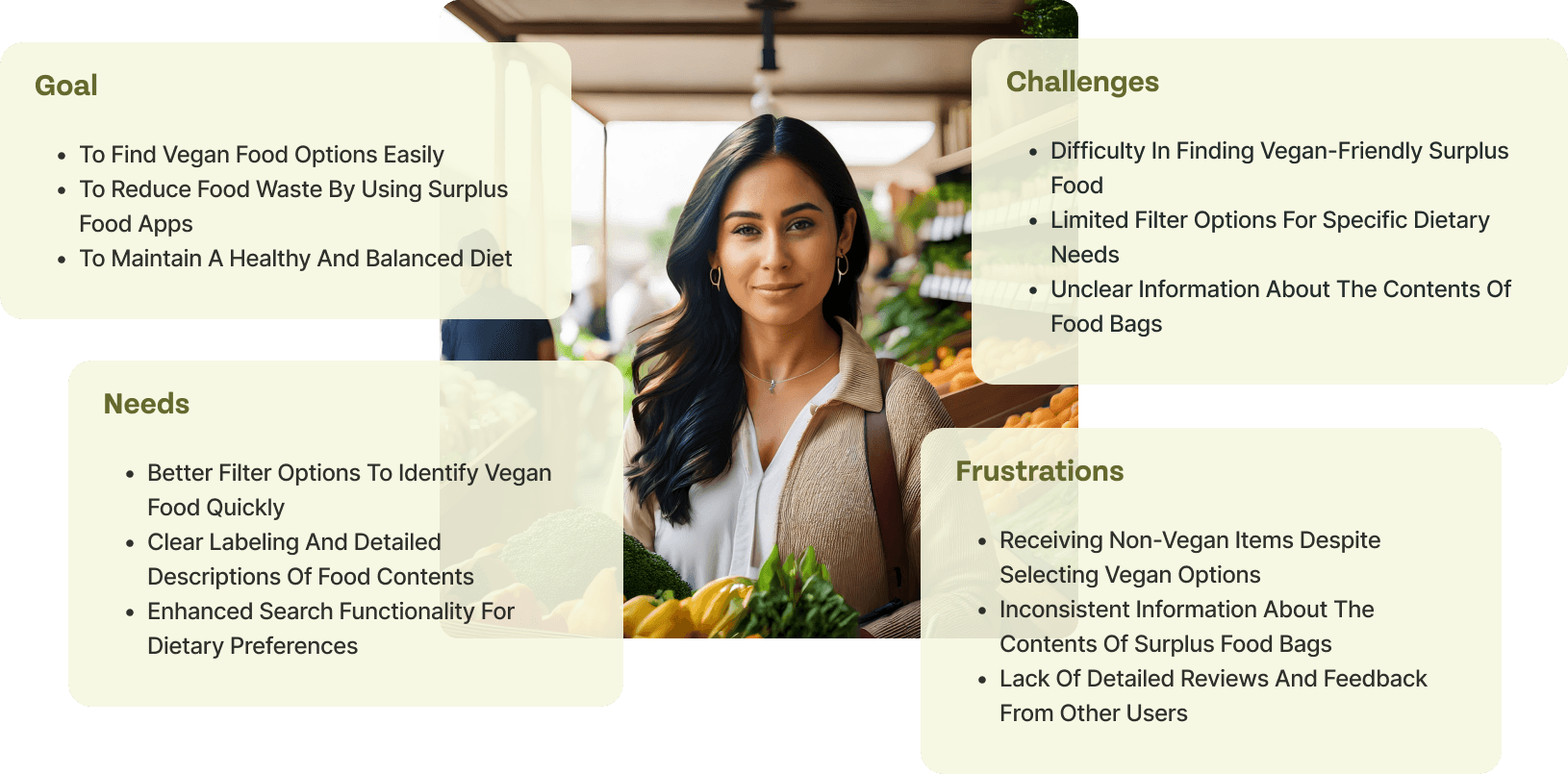
Vanessa is a 29-year-old teacher from Denmark. She is a passionate vegan committed to a healthy and sustainable lifestyle. She is deeply concerned about food waste and seeks environmentally friendly, plant-based options. However, finding vegan meals that meet her dietary preferences can sometimes be challenging.
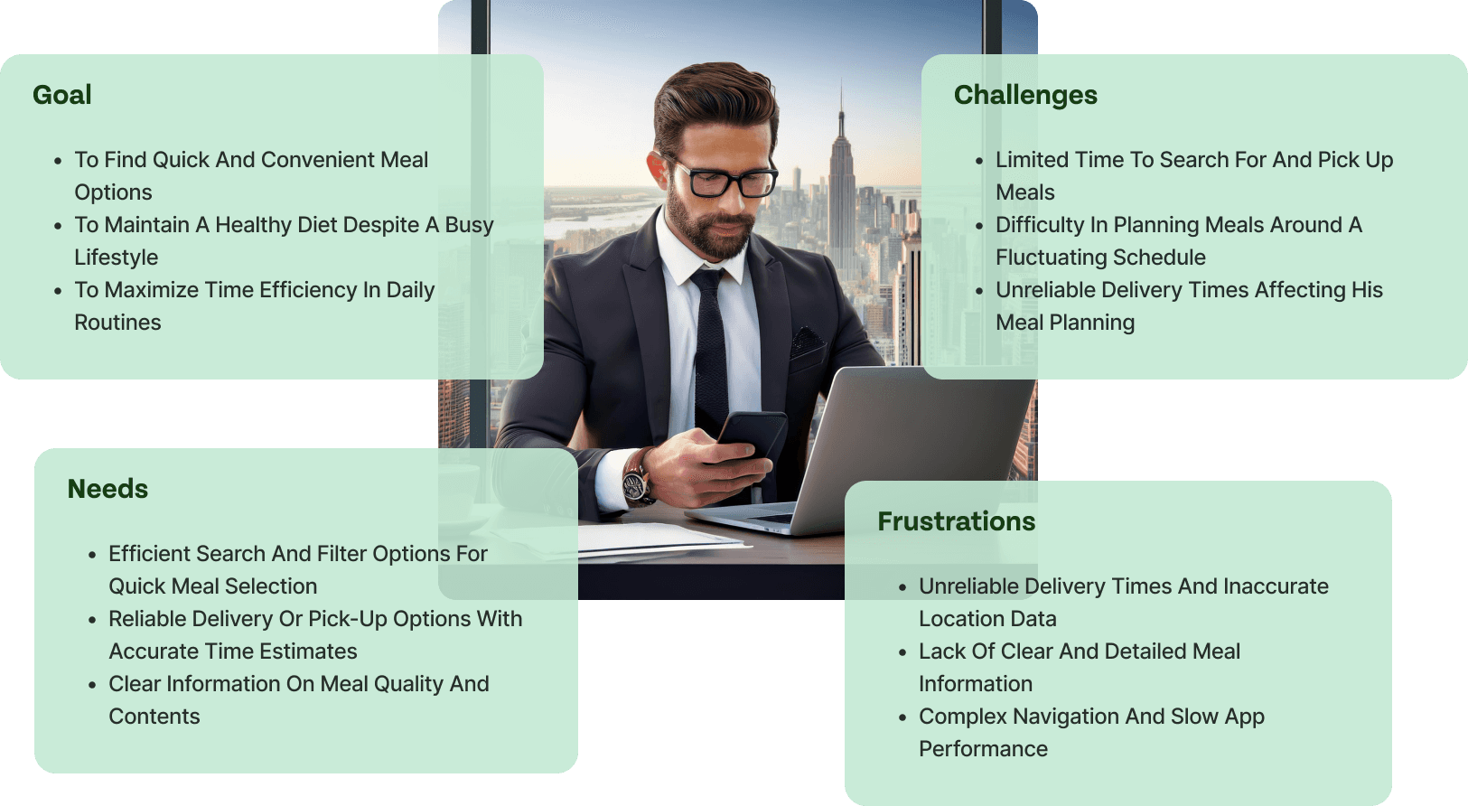
Kevin is a 33-year-old Director from London. He is a dedicated project manager with a demanding job and family responsibilities. He values efficiency and convenience, often finding it hard to manage time for meal planning. He relies on food apps to quickly find reliable and nutritious meal options that fit into his tight schedule.
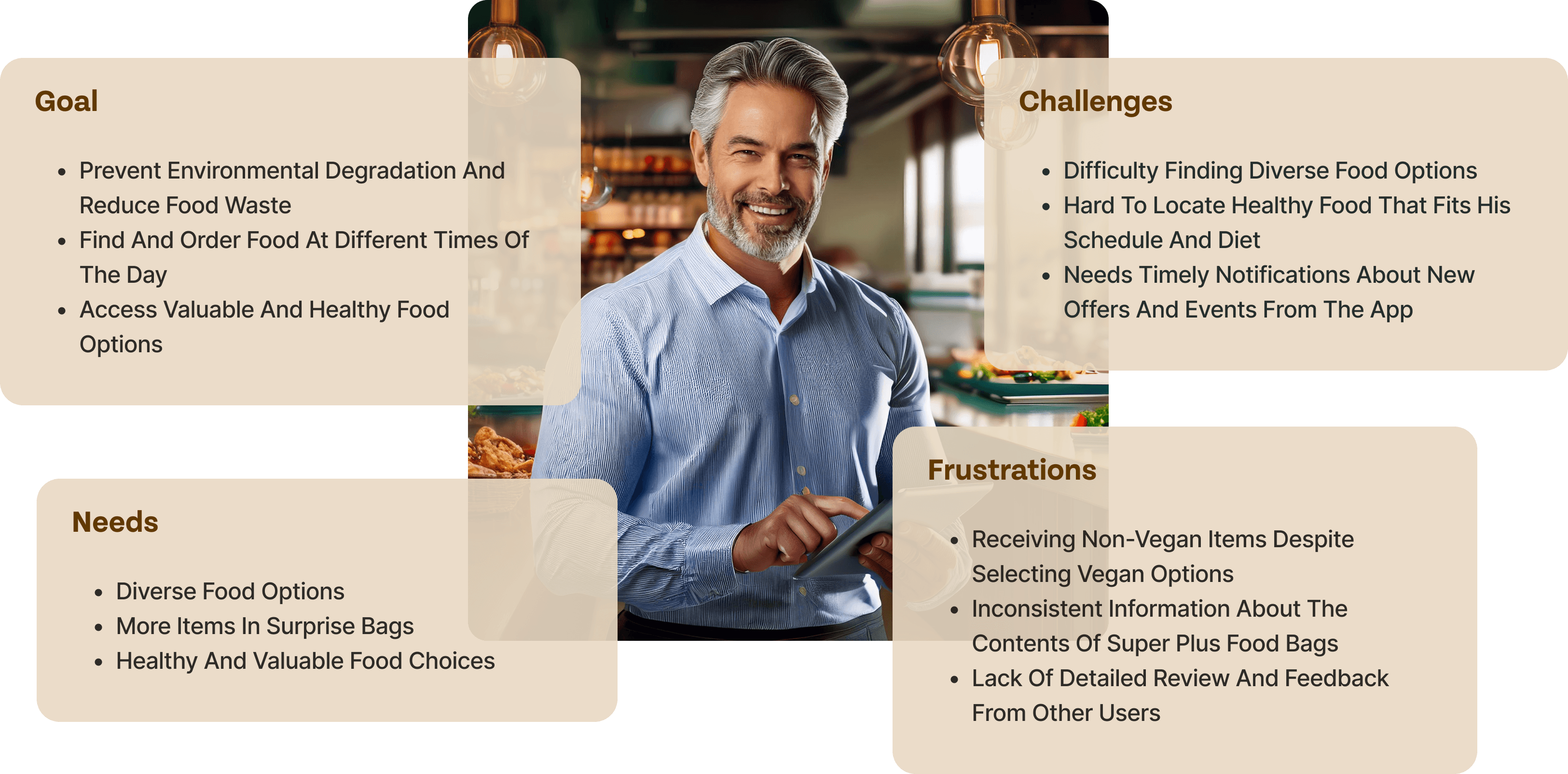
Sam is a 42-year-old teacher from Germany. Sam works in a restaurant and has observed a significant amount of food waste. Passionate about sustainability, he uses eco-friendly applications and prefers ordering healthy food at various times throughout the day.
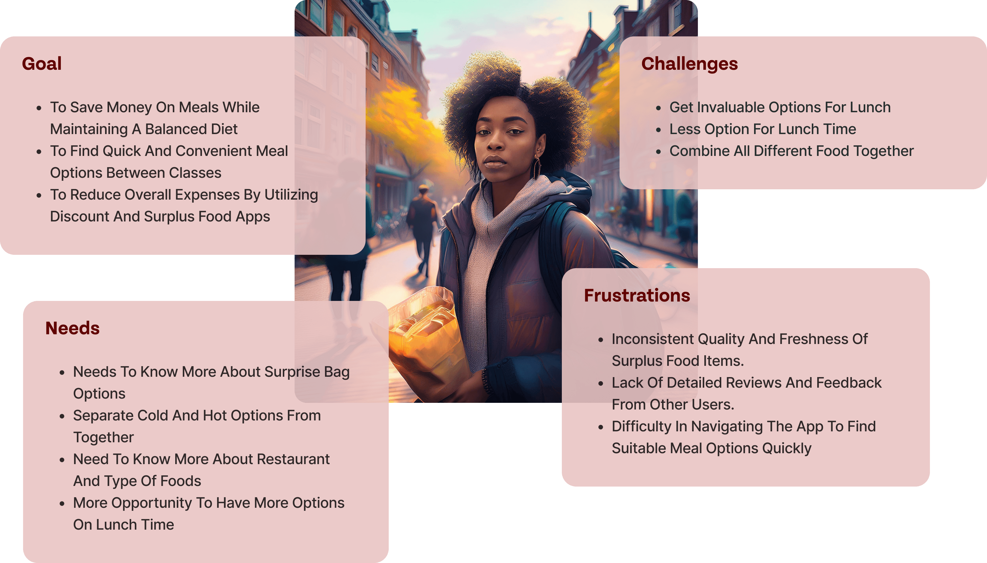
Tina is a 21-year-old student from Amsterdam. She is a diligent college student juggling academics with a part-time job. Her limited budget drive her to seek affordable and nutritious meal options. She frequently uses food apps to save money and find quick meal solutions between classes.
How Might We
How might we ensure that users receive a variety of high-value items in their purchases to enhance their perception of value for money?
How might we improve the search functionality and filter placement to make navigation easier and ensure users can quickly find the most relevant options?
How might we ensure that user feedback section is comprehensive and useful for other users?
How might we ensure that surprise bags accommodate specific dietary needs and preferences, including allergens and vegetarian options?
execution
Competitive Analysis
Identifying User Experience Shortcomings
Through a comprehensive competitor analysis focusing on search functionality, reviews, product information, and rating systems, we identified critical areas where current solutions fall short in delivering a tailored and satisfying user experience.

Deliveroo
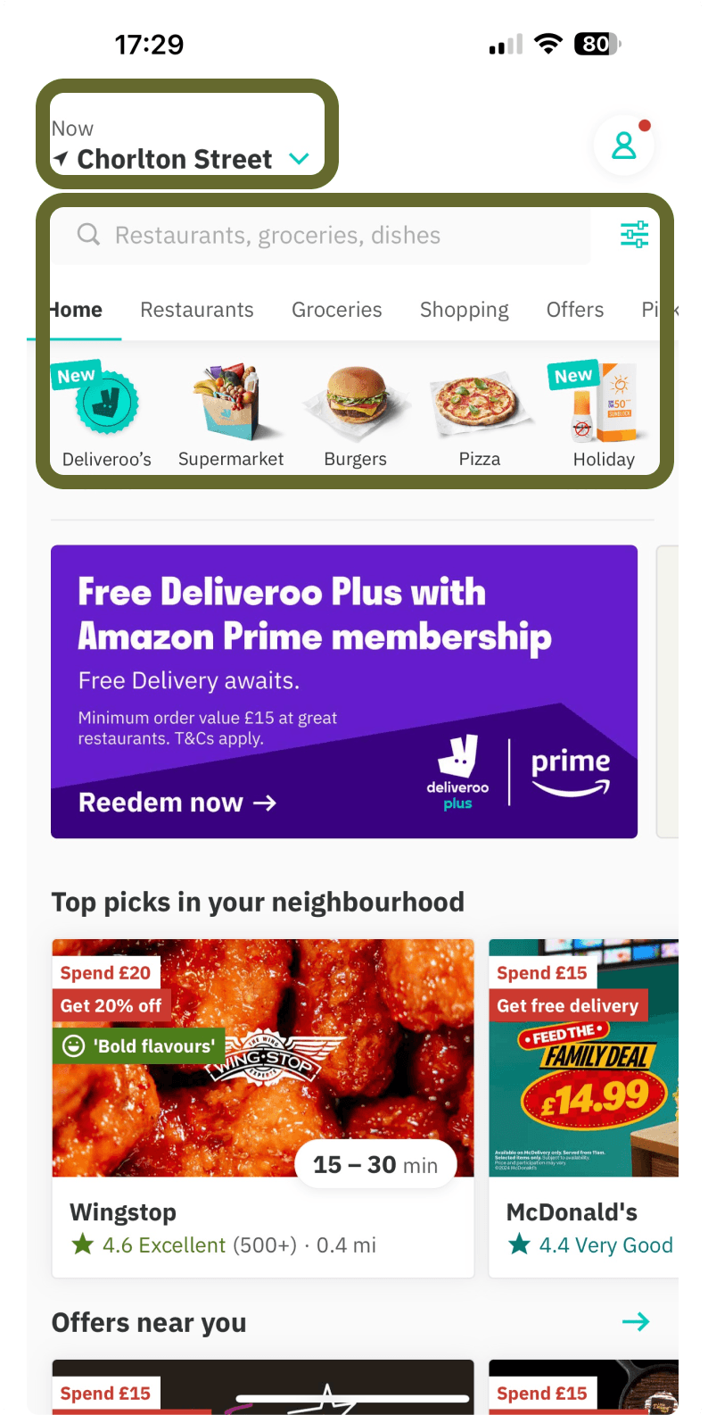
Easily Accessible Search Bar
Category Tabs for Quick Navigation
Visual Filters
Location-Based Filtering
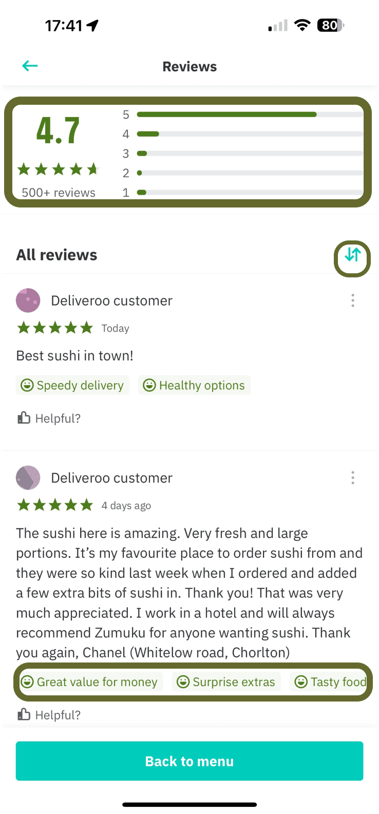
Transparent Star Rating Overview
Detailed Feedback Section
Quick Review Tags
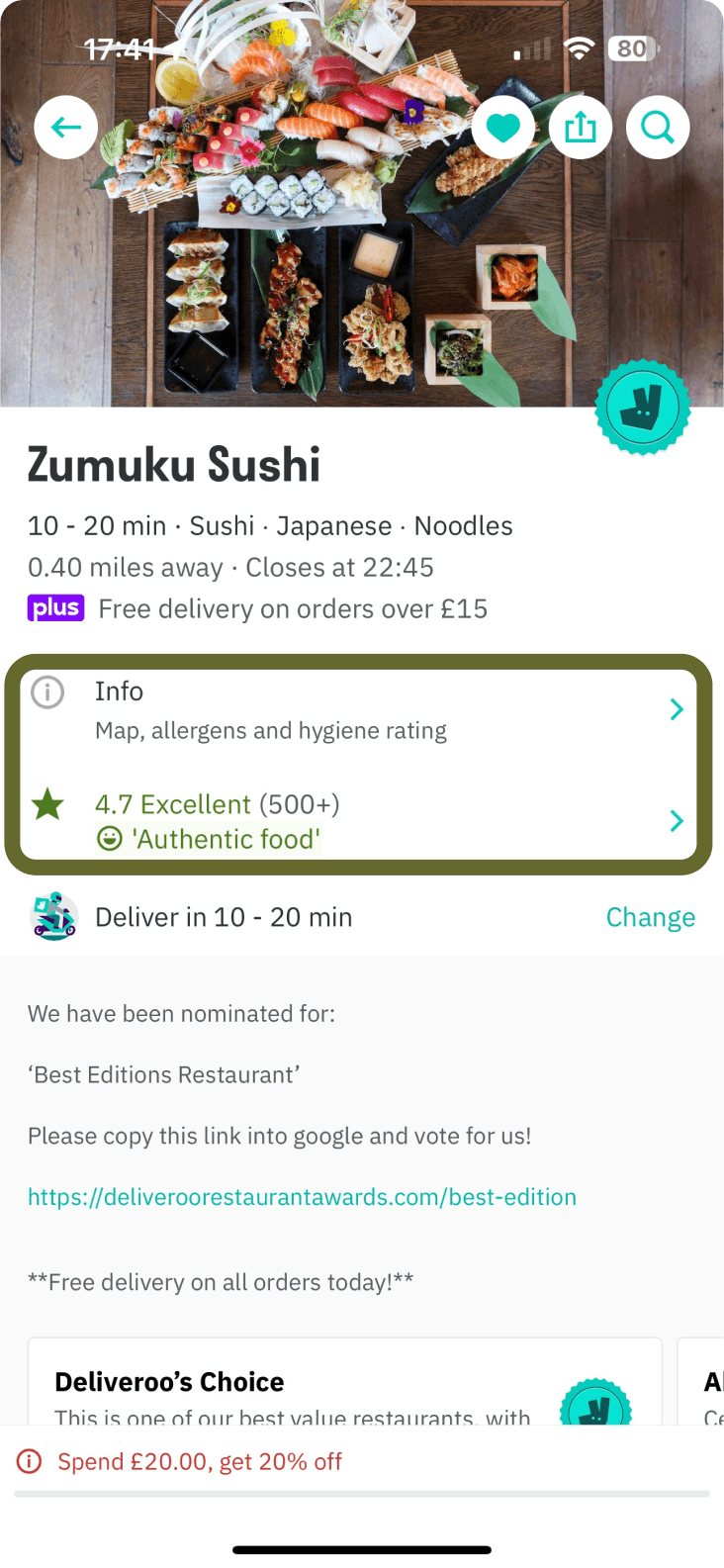
Comprehensive Info Section
High User Rating and Review
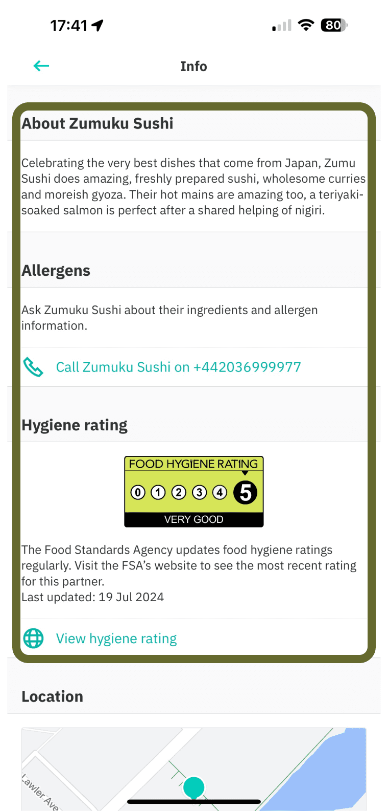
Comprehensive About Section
Allergen Information
Hygiene Rating Transparency

Uber eats
Easily Accessible Search Bar
Streamlined Category Selection
Clear Dietary Selection
Simple Apply and Reset Buttons
Karma
Search Bar Functionality
Quick Access to Categories
Wide range of filters
Detailed Dietary Filters
Interactive Map View
includes a location arrow for navigation
Informative Message
Phenix
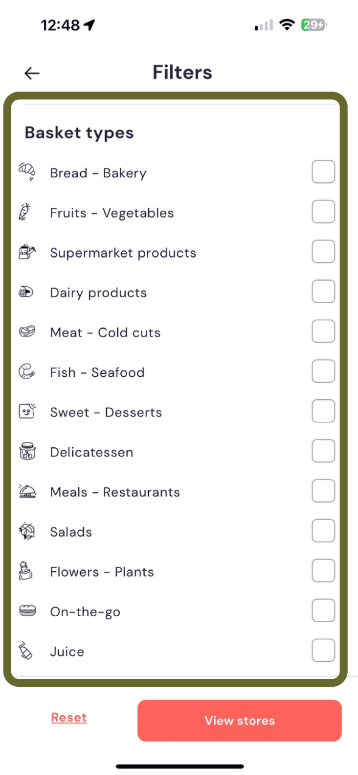
Diverse Category Options
Icon-Based Categories
Simple Checkbox Selection
Reset and View Stores Options
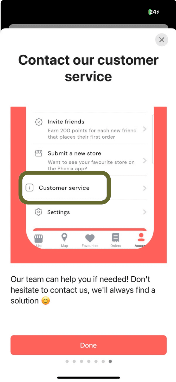
Easily Accessible Customer Support
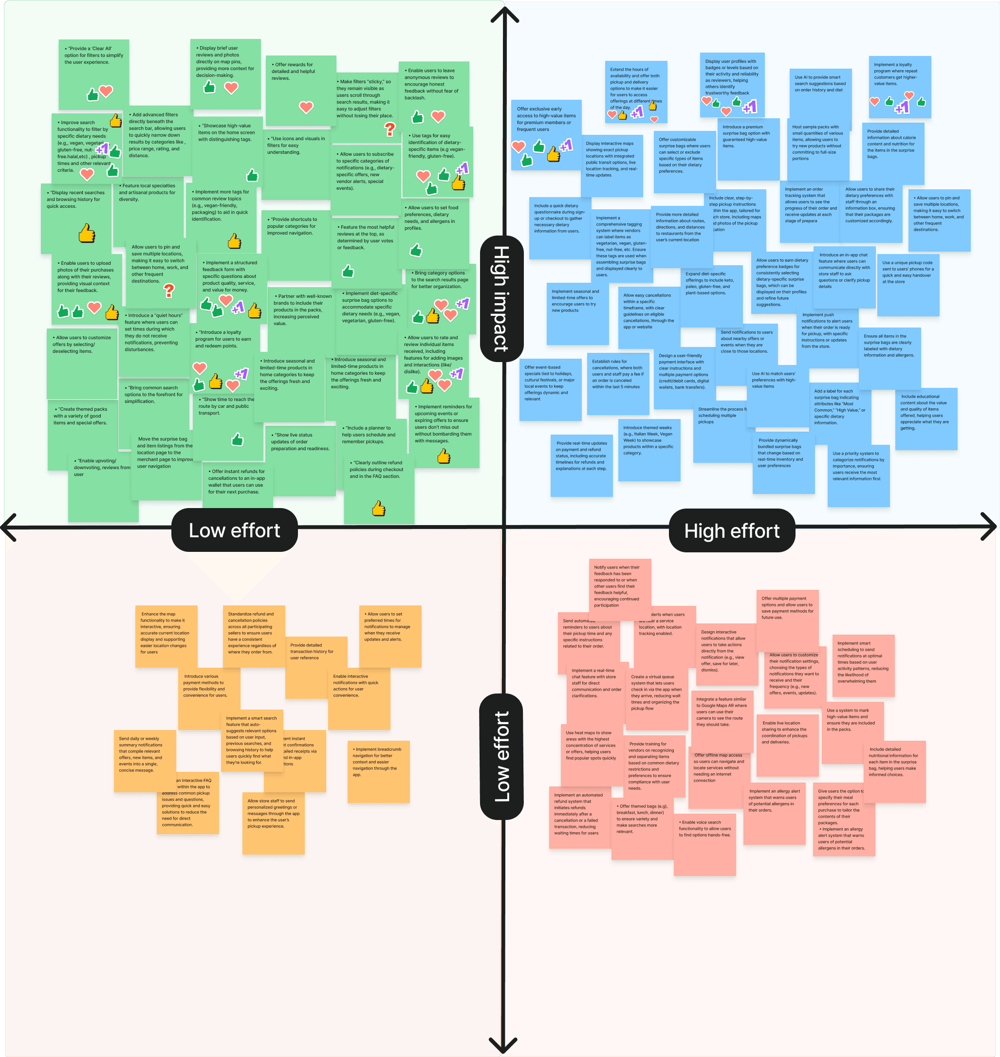
IDEATION
Impact effort matrix
Ideation Workshop + Prioritisation
Through a comprehensive competitor analysis focusing on search functionality, reviews, product information, and rating systems, we identified critical areas where current solutions fall short in delivering a tailored and satisfying user experience.
Testing & Iteration
Iterations from Usability Tests
Targeted Enhancements = Better Outcomes
By running usability tests with previous interviewees, we were able to focus on resolving the most pressing user pain points. These rounds of feedback informed precise tweaks, from refining the challenges layout to optimising the visibility of user-generated reviews.

1. Clarifying Ratings and Reviews
Before:
The label next to the rating number was “Review,” which combined ratings and reviews, causing confusion.
The label “Other offers from this store” was not clearly identifiable as clickable, leading to poor user interaction.
After:
Clearer Labeling: Updated the label to “Rating” and included the number of ratings for clarity.
Direct Navigation: Clicking on the “Rating” label now scrolls directly to the ratings section, improving user navigation.
Prominent Reviews Section: Added a separate and more prominent “Reviews” section at the bottom for easy access to user feedback.
Enhanced Clickability: Changed the color of the “Other offers from this store” label to enhance visibility and indicate it’s clickable.
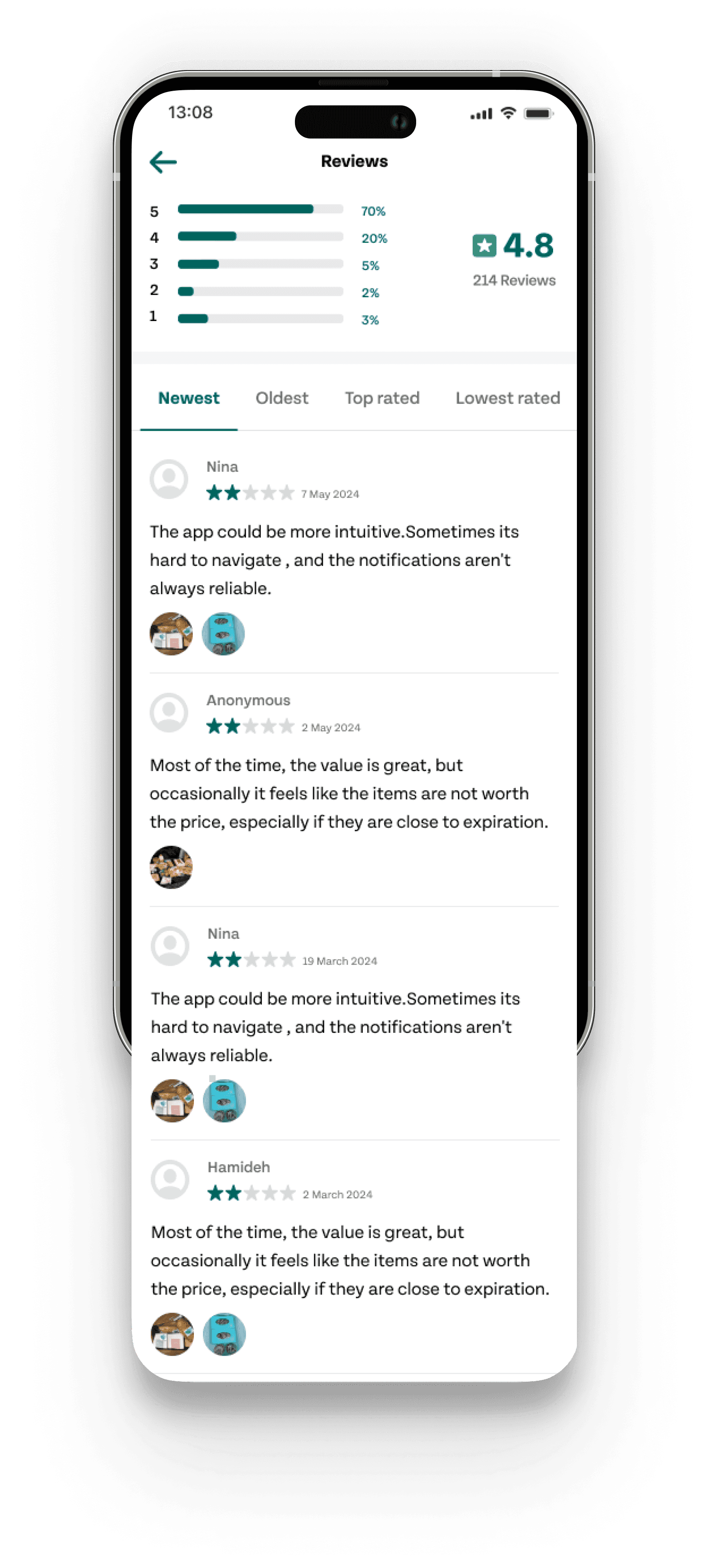
2. Enhancing Review Credibility
Before:
The reviews section offered a basic list of user feedback, lacking visual context and making it difficult for users to judge the authenticity of the reviews.
After:
Rating Breakdown: Introduced a rating percentage chart at the top, offering users a quick overview of the overall sentiment.
Reviewer Photos: Added profile pictures to each reviewer, addressing user concerns about the credibility of anonymous reviews and boosting trust.
Visual Context: Integrated related product images directly into the corresponding reviews, helping users to connect visual elements with the textual feedback, thereby enhancing the relevance and reliability of the reviews.

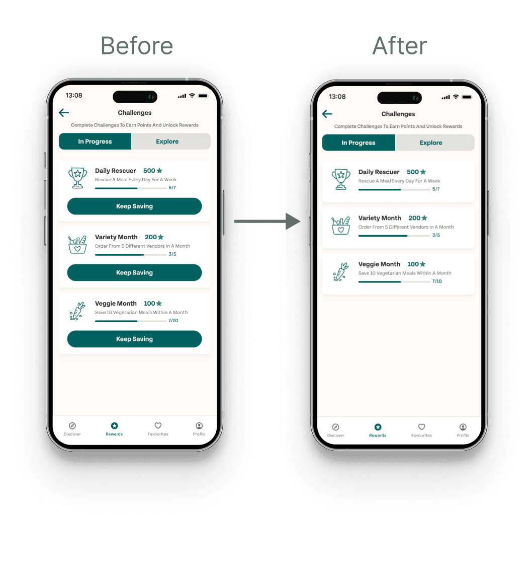
3. Streamlining Challenge Visibility
Before:
The “Keep Saving” button created confusion, as some users thought it would save the challenge, not continue progress.
The button also distracted users from the details of the challenge card, making it harder to focus on progress.
After:
Focused Challenge Details: Removed the “Keep Saving” button to eliminate confusion and enhance focus on the challenge details.
Improved Readability: With the button removed, the challenge card’s details are now more prominent and easier to follow.
Streamlined Interaction: Users can now tap on the challenge card to view more details and available offers, creating a cleaner and more intuitive experience.
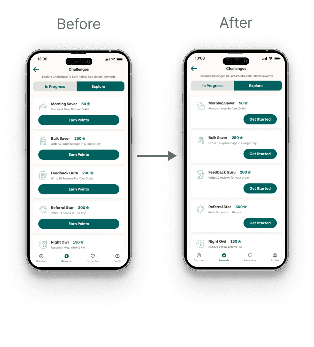
4.Simplified Challenge Engagement
Before:
The previous design had large, green “Earn Points” buttons on each challenge card. These buttons overwhelmed the screen, drawing attention away from the challenge details and cluttering the interface.
After:
Balanced Visuals: The buttons were resized and changed to “Get Started,” reducing their visual dominance. This shift allows users to focus more on the challenge content, creating a cleaner and more engaging interface.
Improved User Focus: The reduced emphasis on buttons makes the challenge details stand out, enhancing the overall user experience by aligning better with minimalist design principles.
The final MVP product


reflections
Project takeaways
A deeper understanding of idea when placed within context, and not just in vacuums
Through a comprehensive competitor analysis focusing on search functionality, reviews, product information, and rating systems, we identified critical areas where current solutions fall short in delivering a tailored and satisfying user experience.
What did we learn from Too Good To Go?
This project offered several key insights and lessons that have shaped our approach to user experience design:
1. Users Prioritize Savings and Experiences Over Sustainability: We realized that, contrary to our initial hypothesis, many users of the app aren’t particularly concerned with environmental issues or reducing food waste. Rather, they’re primarily interested in exploring new experiences and saving money.
2. Balanced Feedback Builds Trust: When people are deciding whether to trust a service before making a purchase, showing only positive reviews can actually have a negative effect. A mix of feedback, including some good and some slightly bad, makes it easier for users to trust the service.
Contact me: shimaghasemi36@gmail.com